Do you need a consultation?

Car Rental with a Driver

Car Rental in Georgia with a Driver: Travel in Comfort

Georgia is a country where every road leads to new discoveries. But what if you want to enjoy the scenery without worrying about driving? Renting a car with a driver is the perfect solution for those who value comfort and want to focus on experiences rather than the road. You’ll enjoy professional drivers, comfortable vehicles, and routes that will stay with you forever.

Why is Renting a Car with a Driver a Great Choice?

Convenience

No need to worry about parking, navigation, or traffic rules. Our drivers are always on time, so you can relax and never worry about delays. Just enjoy our lovely country.

Local Experts

Our drivers know Georgia inside out. They will drive through most scenic routes and will recommend the best places to eat, visit, and how to avoid tourist traps.

Safety

An experienced drivers can handle any road conditions, including mountain curvy roads. All our drivers are professional and all trips are insured.

Business Documentation

We provide all necessary invoices, receipts, and documents for corporate expense reporting.


Who is Car Rental with a Driver For?

Car rental in Georgia with a driver: travel in comfort

This service is ideal for:

  • Families with Children: No need to worry about safety and comfort on the road.
  • Business Travelers: You can work or relax in the car while the driver takes you to meetings.
  • Tourists Who Want to Explore Georgia More Deeply: The driver will act as your guide, sharing insights about local traditions and culture.
  • Groups of Friends: Traveling together is more fun, especially when you don’t have to think about driving.

How to Choose a Car with a Driver?

We offer a wide selection of vehicles to ensure your journey is comfortable:

  • Compact Cars: For city trips or short routes.
  • Spacious Sedans: For business trips or family travel.
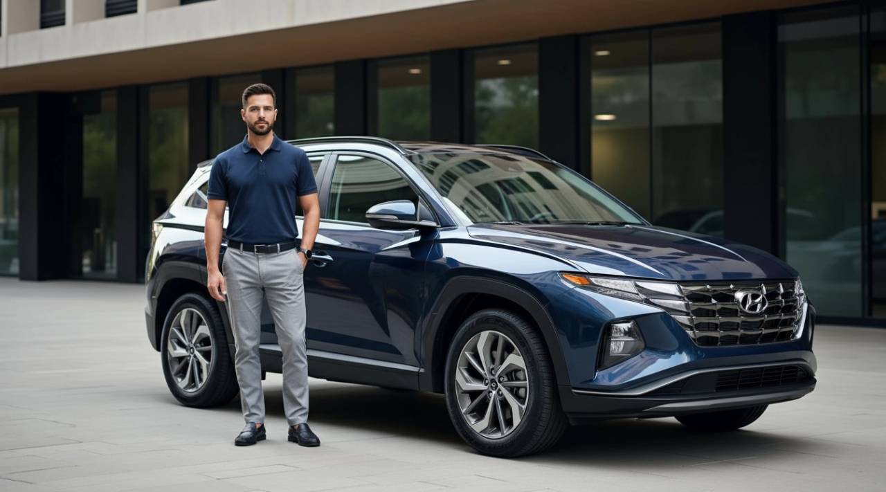
  • SUVs: For mountain trips or remote regions like Svaneti or Tusheti.
  • Minivans: For large groups or trips with lots of luggage.

Popular Routes with a Driver

Tbilisi – Kazbegi – Gudauri

Experience breathtaking mountain landscapes, visit ancient churches, and savor delicious Georgian cuisine along this scenic route.

Mountain views Ancient churches Traditional cuisine

Tbilisi – Mtskheta – Gori

A cultural route from ancient Mtskheta to historic Gori, ending at the fascinating rock-hewn city of Uplistsikhe..

Historic fortresses Rock city Cultural heritage

Kutaisi – Prometheus Cave – Okatse Canyon

Marvel at breathtaking natural attractions including underground caves and dramatic canyon views.

Scenic views Nature Hidden depths

Tbilisi – Kakheti – Sighnaghi

Journey through Georgia's wine country with picturesque vineyards and romantic landscapes of the Alazani Valley.

Wine routes Vineyards Romantic views

How Much Does It Cost to Rent a Car with a Driver in Georgia?

The cost depends on the chosen car, route, and duration of the trip. We offer flexible rates and a personalized approach for each client. Here’s what affects the price.

/* IBM Plex Sans — Latin + Cyrillic (default for most characters) */ @font-face { font-family: "Plex"; src: url("../fonts/plex-sans-400.woff2") format("woff2"); font-weight: 400; font-style: normal; font-display: swap; unicode-range: U+0000-024F, U+0259, U+1E00-1EFF, U+2000-206F, U+2C60-2C7F, U+A720-A7FF, U+0400-04FF, U+0500-052F, U+2DE0-2DFF, U+A640-A69F, U+FE2E-FE2F; } @font-face { font-family: "Plex"; src: url("../fonts/plex-sans-500.woff2") format("woff2"); font-weight: 500; font-style: normal; font-display: swap; unicode-range: U+0000-024F, U+0259, U+1E00-1EFF, U+2000-206F, U+2C60-2C7F, U+A720-A7FF, U+0400-04FF, U+0500-052F, U+2DE0-2DFF, U+A640-A69F, U+FE2E-FE2F; } @font-face { font-family: "Plex"; src: url("../fonts/plex-sans-600.woff2") format("woff2"); font-weight: 600; font-style: normal; font-display: swap; unicode-range: U+0000-024F, U+0259, U+1E00-1EFF, U+2000-206F, U+2C60-2C7F, U+A720-A7FF, U+0400-04FF, U+0500-052F, U+2DE0-2DFF, U+A640-A69F, U+FE2E-FE2F; } @font-face { font-family: "Plex"; src: url("../fonts/plex-sans-700.woff2") format("woff2"); font-weight: 700; font-style: normal; font-display: swap; unicode-range: U+0000-024F, U+0259, U+1E00-1EFF, U+2000-206F, U+2C60-2C7F, U+A720-A7FF, U+0400-04FF, U+0500-052F, U+2DE0-2DFF, U+A640-A69F, U+FE2E-FE2F; } /* Noto Sans Georgian — Georgian script only */ @font-face { font-family: "Plex"; src: url("../fonts/noto-georgian-400.woff2") format("woff2"); font-weight: 400; font-style: normal; font-display: swap; unicode-range: U+10A0-10FF, U+2D00-2D2F; } @font-face { font-family: "Plex"; src: url("../fonts/noto-georgian-500.woff2") format("woff2"); font-weight: 500; font-style: normal; font-display: swap; unicode-range: U+10A0-10FF, U+2D00-2D2F; } @font-face { font-family: "Plex"; src: url("../fonts/noto-georgian-600.woff2") format("woff2"); font-weight: 600; font-style: normal; font-display: swap; unicode-range: U+10A0-10FF, U+2D00-2D2F; } @font-face { font-family: "Plex"; src: url("../fonts/noto-georgian-700.woff2") format("woff2"); font-weight: 700; font-style: normal; font-display: swap; unicode-range: U+10A0-10FF, U+2D00-2D2F; } :root { --font-body: "Plex", -apple-system, BlinkMacSystemFont, "Segoe UI", Roboto, sans-serif; --font-display: "Plex", -apple-system, BlinkMacSystemFont, sans-serif; --text-xs: 0.75rem; --text-sm: 0.875rem; --text-base: 1rem; --text-lg: 1.125rem; --text-xl: 1.25rem; --text-2xl: 1.5rem; --text-3xl: 1.875rem; --text-4xl: 2.25rem; --leading-tight: 1.25; --leading-normal: 1.5; --leading-relaxed: 1.65; } body { font-family: var(--font-body); font-weight: 400; line-height: var(--leading-normal); overflow-x: hidden; color: #2e2e2e; background: #F4F4F4; } h1, h2, h3, h4, h5, h6 { font-family: var(--font-display); font-weight: 600; line-height: var(--leading-tight); } input, select, textarea, button { font-family: inherit; } .bg-gray{ background: #F1F1F1; } a:focus{ outline:none; } a{ text-decoration: none; color: #c51315; } .img-wrap img{ width: 100%; height: 100%; object-fit:cover; } .img-wrap-contain img{ object-fit:contain; } .text, .item-text, .subtitle{ font-weight: 400; } .subtitle{ font-family: var(--font-display); font-size: 24px; line-height: normal; } .none{ display: none; } p{ margin-bottom: 20px; } p img{ border-radius:30px; height: auto; } .content-img .page-img img{ border-radius:30px; } .content-img .page-img{ width: 45%; float: left; padding-right: 30px; padding-bottom: 30px; } h2,h1{ line-height: 1.4; margin: 0; position: relative; font-family: var(--font-display); font-weight: 600; color:#2e2e2e; margin-top: 0; } h2,h1{ font-size: 40px; margin-bottom: 40px; } h3, h4, h5, h6{ color:#2e2e2e; line-height: normal; font-weight: 500; font-size: 30px; margin-bottom: 25px; margin-top: 0; } ol, ul{ margin-bottom: 20px; padding-left: 15px; } ol li{ padding-left: 10px; } .content{ font-size: 17px; line-height: 1.7; } .content h2, .content h1, .content h3, .content h4, .content h5, .content h6{ margin-bottom: 20px; } .content ul{ list-style: none; margin-bottom: 30px; padding-left: 40px; } .content ul li{ position: relative; margin-bottom: 9px; } .content ul li:before{ content: ''; width: 10px; height: 10px; background: #c51315; border-radius: 100%; display: block; position: absolute; top: 10px; left: -25px; } .content ol{ margin-bottom: 30px; padding-left: 20px; } .content ol li{ position: relative; margin-bottom: 9px; padding-left: 10px; } .content ol li::marker{ font-weight:900; color: #c51315; } .page-title h1 { font-size: 40px; margin-bottom: 25px; text-align: left; } .content h1{ font-size: 32px; font-family: var(--font-body); } .content h2{ font-size: 32px; font-family: var(--font-body); } .content h3, .content h4, .content h5, .content h6{ font-size: 28px; } .content img{ border-radius:30px; height: auto; } /*language-block-inner*/ .language-block-inner{ } .language-block-inner .en:before{ content: ''; display: block; background-image: url(../images/en.svg); background-size: contain; background-repeat: no-repeat; width: 22px; height: 22px; } .language-block-inner .ru:before{ content: ''; display: block; background-image: url(../images/ru.svg); background-size: contain; background-repeat: no-repeat; width: 22px; height: 22px; } .language-block-inner .item-inner{ display: flex; align-items: center; gap:7px; padding: 7px; color: #fff; text-transform: uppercase; height: 100%; } .language-block{ height: 100%; display: inline-block; font-size: 16px; position: relative; z-index: 300; } .language-block-inner{ position: relative; height: 40px; width: 80px; line-height: 36px; padding-top: 40px; } .language-block-inner:after{ content: ""; display: block; position: absolute; width: 6px; height: 6px; top: calc(50% - 4px); right: 8px; border-bottom: 1px solid #fff; border-right: 1px solid #fff; transform: rotate(45deg); transition: all 300ms ease-out; } .language-block-inner > .item{ display: none; background: #f39200; height: 40px; } .language-block-inner > .item:nth-child(2){ border-top: 1px solid #0000000a; } .language-block-inner > .item{ border-radius: 0 0 9px 9px; } .language-block a{ display: block; padding: 0 12px; background: rgba(255,255,255,1); color: #367CC2; } .language-block a:hover{ color: #f05157; } .language-block-inner:hover > .item{ display: block; } .language-block-inner > .item.active{ display: block; position: absolute; left: 0; top: 0; width: 100%; height: 100%; border-radius: 9px; } .language-block-inner:hover > .item.active{ border-radius: 9px 9px 0 0; } .language-block .active .item-inner{ color: #fff !important; background: transparent; } .language-block .active:after{ content: ""; position: absolute; top: 0; bottom: 0; left:0; right:0; z-index: 20; } /*language-block-inner./*/ .button{ background: #f39200; padding: 10px 20px; font-size:17px; z-index: 10; color:#fff; display: inline-block; border:2px solid #f39200; text-align: center; text-decoration: none; transition: all 200ms ease-out; border-radius: 11px; line-height: 1; } .button:hover{ /* color:#C51315; */ background: #313131; border-color:#313131; text-decoration: none; } .btn{ background: transparent; color:#C51315; border:2px solid #C51315; } .btn:hover{ background: #C51315; color:#fff; border:2px solid #C51315; } a{ transition: all 200ms ease-out; } a:hover{ transition: all 200ms ease-out; } .main-wrapper{ display: flex; flex-direction: column; min-height: 100%; } .Carousel-module__branding--X3Gce{ display:none !important; } .header-main-wrapper{ } .main{ flex-grow: 1; padding-right: 5%; padding-left: 5%; } .logo{ width: 250px; } .logo img{ max-width: 100%; } .pb{ padding-bottom: 80px; } .pt{ padding-top: 80px; } .mb{ margin-bottom: 80px; } .mt{ margin-top: 80px; } @media (max-width: 1229px){ .content{ font-size: 15px; } blockquote{ font-size: 15px; } } @media (max-width: 991px){ .page-title h1 { font-size: 35px; margin-bottom: 30px; text-align: left; } h1{ font-size: 30px; margin-bottom: 30px; } h2{ font-size: 30px; margin-bottom: 30px; } h3{ font-size: 25px; margin-bottom: 25px; } .content-img .page-img{ width: 100%; padding: 0; margin-bottom: 30px; } } @media (max-width: 767px) { .page-title h1 { font-size: 25px; margin-bottom: 20px; text-align: left; } h2{ font-size: 30px; margin-bottom: 30px; } h3{ font-size: 18px; margin-bottom: 30px; } .content h1{ font-size: 30px; } .content h2{ font-size: 30px; } .content h3, .content h4, .content h5, .content h6{ font-size: 18px; } .content{ font-size: 15px; } .pb{ padding-bottom: 40px; } .pt{ padding-top: 40px; } .mb{ margin-bottom: 40px; } .mt{ margin-top: 40px; } } @media (max-width: 500px){ .subtitle{ font-size: 18px; } p img{ border-radius: 20px; } .content img{ border-radius: 20px; } .content-img .page-img img{ border-radius:20px; } } /*breadcrumb*/ .breadcrumbs { position: relative; z-index: 1; padding-top: 32px; padding-top: 40px; font-size: 18px; color: #949494; } .breadcrumbs ul{ padding: 0; margin-bottom: 20px; } .breadcrumbs ul li { position: relative; display: inline; } .breadcrumbs ul li:after { content: '/'; padding: 0 7px 0 9px; } .breadcrumbs ul li:last-child:after { content: none; } .breadcrumbs ul li a { text-decoration: none; color: #949494; } .breadcrumbs ul li a:hover{ color: #2B323A; } @media (max-width:767px) { .breadcrumbs{ font-size: 16px; } } @media (max-width: 475px) { .breadcrumbs{ font-size: 14px; } } /*breadcrumb./*/ /* pagination */ .pagination ul{ padding: 0; display: flex; margin: 0; } .pagination-wrap{ width: 100%; } .pagination{ display: inline-block; padding: 0; margin-top: 40px; margin-bottom: 40px; } .pagination li{ display: inline-block; height: auto; margin-bottom: 40px; } .pagination li > span{ cursor: default; } .pagination li > a, .pagination li > span{ position: relative; padding: 6px 12px; margin-left: -1px; line-height: 1.42857143; color: #626262; text-decoration: none; background-color: #fff; border: 1px solid #ddd; font-weight: 100; margin-right: 5px; border-radius: 7px; height: 30px; width: 30px; display: flex; align-items: center; justify-content: center; } .pagination li:first-child > a, .pagination li:first-child > span{ margin-left: 0; } .pagination li > a:hover{ background-color: #EEEEEE; } .pagination .active > a, .pagination .active > a:hover{ background-color: #C51315; color: #fff; border-color: #C51315; cursor: default; } @media (max-width:767px) { .pagination{ margin-bottom: 0px; } } /* /. pagination */ /*********************slider***************************/ .slick-prev, .slick-next{ z-index: 10; width: 40px; height: 40px; transition: all 200ms ease-out; border-radius: 100%; background: #86827924; transform: none !important; } .slick-prev:before, .slick-next:before{ display: block; height: 30px; width: 30px; transition: all 200ms ease-out; } .slick-prev:before, .slick-next:before{ border-top: 2px solid #949494; border-right: 2px solid #949494; font-size: 14px !important; opacity: 1 !important; color:transparent !important; } .slick-prev{ left: 20px!important; z-index: 2; } .slick-next{ right: 20px!important; } .slick-prev:hover, .slick-prev:focus, .slick-next:hover, .slick-next:focus{ border-color:#9eb5d0 !important; transition: all 200ms ease-out; } .slick-prev:hover:before, .slick-prev:focus:before, .slick-next:hover:before, .slick-next:focus:before{ transition: all 200ms ease-out; } .slick-dots li button:before{ font-size: 15px!important; } .slick-dots li{ margin: 0 2px!important; } .slick-dots li button:before, .slick-dots li button:before{ transition: all 200ms ease-out; } .slick-dots li.slick-active button:before{ color: #868279!important; } .slick-dots li button:hover:before, .slick-dots li button:focus:before{ color: #868279!important; } .slick-dots li button:before{ color: #8989897a!important; } .slick-prev:before, .slick-next:before{ border-color:#868279; top: 15px; height: 10px; width: 10px; position: absolute; } .slick-prev:before{ transform: rotate(225deg); left: 17px; } .slick-prev:hover, .slick-next:hover{ background:#8989897a!important; transition: all 200ms ease-out; } .slick-prev:hover:before, .slick-next:hover:before{ border-color:#eeedec !important; transition: all 200ms ease-out; } .slick-next:before{ transform: rotate(45deg); left: 14px; } /*********************slider***************************/ @media (max-width: 1979px){ } @media (max-width: 1575px){ /* .slick-prev, .slick-next{ display: none!important; } */ } /************************ mob-menu begin ************/ .menu-button{ display: none; } .mobile-menu{ display: none; } .overlay{ display: none; } @media only screen and (max-width: 991px){ .menu-button{ position: fixed; left: 15px; top: 31px; width: 30px; height: 20px; cursor: pointer; z-index: 2000; display: block; } .mobile-menu .header-contacts{ display: none; } .icon-menu-burger { height: 2px; width: 20px; position: absolute; top: 50%; left: 50%; margin: -1px 0 0 -15px; transition: transform 0.2s ease 0s; } .icon-menu-burger__line { background: #1D1D1D; height: 100%; width: 100%; position: absolute; top: 0; left: 0; transition: transform 0.2s linear 0.2s; } .icon-menu-burger:before, .icon-menu-burger:after { background: #1D1D1D; content: ''; height: 100%; width: 100%; position: absolute; left: 0; } .menu-button.active .icon-menu-burger__line, .menu-button.active .icon-menu-burger:before, .menu-button.active .icon-menu-burger:after { background:#1d1d1d !important; } .menu-button.active .icon-menu-burger{ transform: rotate(45deg); transition: transform 0.2s linear 0.4s; } .menu-button.active .icon-menu-burger__line{ transform: rotate(90deg); } .icon-menu-burger:before { top: -7px; transition: top 0.2s linear 0.4s; } .icon-menu-burger:after { bottom: -7px; transition: bottom 0.2s linear 0.4s; } .menu-button.active .icon-menu-burger:before { transition: top 0.2s linear; top: 0; } .menu-button.active .icon-menu-burger:after { transition: bottom 0.2s linear; bottom: 0; } .mobile-menu { position: fixed; top: -100%; background: #fbfbfb; width: 100%; max-width: 100%; z-index: 1000; transition: all 200ms ease-out; /* border-radius: 0 0 20px 20px; */ display: block; max-height: calc(100% - 80px); overflow-y: auto; } .overlay { position: fixed; top: 0; left: 0; width: 100%; height: 100%; background: rgba(0,0,0,0.8); z-index: -100; opacity: 0; transition: opacity 200ms ease-out; display: block; } .down{ position: relative; } .mobile-menu .dropdown-button + ul { position: static; width: 100%; display: none; } .mobile-menu-inner ul{ padding: 0; list-style: none; padding-left: 15px; padding-right: 15px; padding-bottom: 10px; position: relative; } .mobile-menu-wrapper{ } /* .mobile-menu-inner ul:before{ position: absolute; content: ''; display: block; width: 50px; height: 2px; border-radius:3px; background: #000; left: calc(50% - 25px); bottom: 20px; z-index: 1; } */ .svg-icon{ } .mobile-menu .dropdown-button{ display: block; position: absolute; top: 8px; right: -10px; height: 28px; width: 48px; z-index: 10; transition: all 200ms ease-out; } .mobile-menu .dropdown-button:before { content: ""; display: block; position: absolute; width: 12px; height: 12px; top: 5px; left: 16px; border-bottom: 1px solid #1d1d1d; border-right: 1px solid #1d1d1d; transform: rotate(45deg); transition: all 300ms ease-out; } .mobile-menu ul ul .dropdown-button:before{ width: 6px; height: 6px; content: "+"; border: none; color: #fff; -moz-transform: rotate(0) !important; -webkit-transform: rotate(0) !important; -o-transform: rotate(0) !important; -ms-transform: rotate(0) !important; transform: rotate(0) !important; top: 7px !important; left: 17px; font-size: 16px; } .mobile-menu ul > li > ul > li{ color: #fff; margin-bottom: 1px; } .mobile-menu ul > li > ul > li a{ padding: 10px 30px; color:#1d1d1d; display: block; position: relative; } .mobile-menu ul > li > ul > li a:before{ position: absolute; content: ''; top: 20px; left: 14px; background: #1d1d1d; border-radius: 100%; width: 5px; height: 5px; } .mobile-menu ul > li > ul > li > ul > li a{ padding: 5px 0px 5px 50px; } .mobile-menu-inner ul ul{ padding: 10px 0; font-size: 17px; } .dropdown-button{ cursor:pointer; } .top-menu-wrapper-middle-min .active > .dropdown-button:before { border-color: #2e2e2e; } .mobile-menu .active:before { transform: rotate(225deg); top: 14px; } .mobile-menu ul ul ul a{ position: relative; } .mobile-menu ul ul ul a:before{ content: ""; position: absolute; top: 13px; left: 39px; width: 4px; height: 4px; border-radius: 1px; background: rgba(255, 255, 255, 0.8); } .mobile-menu.open { top: 80px; } .mobile-menu.open + .overlay{ z-index: 600; opacity: 1; } .mobile-menu { overflow-y: scroll; } .mobile-menu ul > li > a { display: block; text-decoration: none; color: #1d1d1d; padding: 10px 0 10px; font-size: 20px; letter-spacing: 1px; margin-bottom: 1px; font-weight: 500; border-bottom: 1px solid #00000008; } .mobile-menu ul > li:last-child a { border:none; } .mobile-menu ul > li > a:hover{ color: #c51315; } .mobile-menu ul > li > ul > li a:hover{ color: #c51315; } } @media only screen and (max-width: 520px){ .mobile-menu .header-contacts{ display: flex; align-items: flex-start; padding: 20px 20px; } .mobile-menu-inner ul{ padding-bottom: 0; } } /************************* mob-menu end *********************./*/ /************* header*************************/ .header-img-wrap > div:not(:first-of-type), .comment-inner.comment-inner-slider > div:not(:first-of-type){ display: none; } .header-slider{ width: 100%; overflow: hidden; /* background: #EDEFF3; */ } .header-slider-overflow{ overflow: hidden; } .header-slider-wrapper{ position: relative; } .header-slider-wrapper:before{ content: ''; background: #1D1D1D; width: 300px; height: 300px; position: absolute; z-index: 0; right: -200px; top: 0px; display: block; border-radius: 0 0 30px 0; display: none; } .top-menu ul{ list-style: none; display: flex; flex-wrap: nowrap; padding-left: 0; margin: 0; gap: 10px 45px; align-items: center; } .top-menu ul > li > ul{ list-style: none; padding: 5px 0; display: block; flex-wrap: nowrap; justify-content: flex-end; flex-direction: column; gap: 0px; align-items: flex-start; } .header-wrapper{ background: #fff; position: fixed; z-index: 1000; top: 0; left: 0; right: 0; /* background: #EDEFF3; */ box-shadow: 0 0 0px #0000000a; } .header-push{ height: 110px; transition:all 300ms ease; } .header{ position: relative; display: flex; flex-wrap: nowrap; justify-content: space-between; font-size: 20px; gap:40px; height: 110px; transition:all 300ms ease; } .header-wrapper.fixed{ box-shadow: 0 0 20px #00000012; } .header-wrapper.fixed .header{ height: 80px; } .header-wrapper.fixed + .header-push{ height: 80px; } .header .gray-header{ display: flex; align-items: center; flex-grow: 1; justify-content: space-between; gap:40px; } .header .gray-header .left-part{ display: flex; align-items: center; gap:50px; } .header .gray-header .right-part{ display: flex; align-items: center; } .header-contacts{ display: flex; flex-direction: column; align-items: flex-end; gap:8px; position: relative; padding-left: 40px; background: #f39200; padding: 13px 0; padding-left: 50px; padding-right: 90px; justify-content: center; position: relative; } .header-contacts:before{ content: ''; background: #1D1D1D; width: 200px; height: 100%; position: absolute; z-index: 0; right: -200px; top: 0px; display: block; display: none; } .logo-wrap{ display: flex; align-items: center; } .header-phone{ display: flex; flex-wrap: nowrap; align-items: flex-start; justify-content: flex-start; } .header-phone .phone{ font-size: 23px; line-height: 1; color: #fff; white-space:nowrap; } .header-phone .phone:hover{ color: #c51315; } .mobile-menu .header-adress, .mobile-menu .header-phone{ grid-gap:10px; } .logo-img-wrap{ display: block; cursor: pointer; } .logo-wrap img{ width: auto; height: 63px; max-width: 190px; } .button-wrapper{ z-index: 10; } .top-menu .down{ display: flex !important; flex-direction: row; flex-wrap: nowrap; margin-right: 10px; } .top-menu .down > ul > .down > .dropdown-button{ display: none; } .top-menu{ height: 100%; display: flex; align-items: center; } .top-menu ul > li{ display: inline-block; position: relative; } .top-menu ul > li > a{ color: #000; font-size: 17px; } .top-menu ul > li:hover > a{ color:#C51315; text-decoration: none; } .top-menu ul > li:first-of-type{ margin-left: 0; } .top-menu ul > li > ul > li{ margin-left: 0px; margin-bottom: 1px; } .top-menuul > li:first-of-type{ margin-left: 0; } .top-menu ul > li > ul{ position: absolute; top: 35px; left: 0; width: 270px; visibility: hidden; opacity: 0; transition: all 200ms ease-out; display: flex; flex-direction: column; z-index: 300; border-radius: 0 0 15px 15px; box-shadow: 0px 32px 20px #2e2e2e17; padding-bottom: 20px; padding-top: 10px; z-index: 2; } .top-menu ul > li > ul:before{ content:""; display: block; position: absolute; width: 100%; height: 14px; top: -14px; left: 0; } .top-menu ul > li > ul > li > a{ display: block; padding: 5px 33px 5px 20px; } .top-menu ul > li > ul > li{ transition: all 200ms ease-out; } .top-menu ul > li > ul > li:hover > a{ color:#C51315; transition: all 200ms ease-out; } .top-menu ul > li > ul > li > ul{ box-shadow: 0 0 20px #2e2e2e17; left: 258px; top: 20px; border-radius: 0 15px 15px 15px; } .top-menu ul ul ul li:hover a{ color:#C51315; } .top-menu ul > li:hover > ul{ visibility: visible; opacity: 1; background: #ffffff; } .top-menu ul > li:hover .dropdown-button{ top: 0; } .top-menu .dropdown-button{ display: block; position: absolute; top: 9px; right: -12px; height: 28px; width: 18px; width: 6px; height: 6px; z-index: 10; transition: all 200ms ease-out; } .top-menu .dropdown-button:before { content: ""; display: block; position: absolute; width: 6px; height: 6px; top: 0; left: 0; border-bottom: 1px solid #2e2e2e; border-right: 1px solid #2e2e2e; transform: rotate(45deg); transition: all 300ms ease-out; } .top-menu .new-dropdown-button{ display: block; position: absolute; top: calc(50% - 1px); right: 9px; height: 12px; width: 12px; z-index: 10; transition: all 200ms ease-out; } .top-menu .new-dropdown-button:before { content: ""; display: block; position: absolute; width: 6px; height: 6px; top: 0; left: 0; border-bottom: 1px solid #2e2e2e9e; border-right: 1px solid #2e2e2e9e; transform: rotate(315deg); transition: all 300ms ease-out; } .top-menu .down:hover .dropdown-button:before{ transform: rotate(225deg); top: 12px; border-color: #C51315; } .top-menu .new_down:hover .new-dropdown-button:before{ border-color: #C51315; } .header-img-wrap{ height: auto; margin:0 -15px; } .header-img{ position: relative; width: 100%; min-height: 100%; background-position: center; background-repeat: no-repeat; color:#fff; display: flex; align-items: center; background-size: cover; margin: 0 15px; /* aspect-ratio: 1720 / 580; */ height: auto; border-radius: 0 0 30px 30px; } .header-img-wrap .slick-track{ display: flex; } .header-img-inner{ display: flex; flex-direction: column; justify-content: center; padding: 118px 106px; height: 100%; width: 75%; } .header-img-inner .slider-features{ display: grid; grid-template-columns:1fr 1fr 1fr; gap:22px; margin-bottom: 40px; } .header-img-inner .slider-features .item{ display: flex; gap:20px; align-items: center; } .header-img-inner .slider-features .img-wrap{ width: 45px; height: 45px; flex-shrink:0; } .header-img-inner .slider-features .title{ font-size: 15px; font-weight: 400; margin-bottom: 0; line-height: 1.5; } .header-img .title{ font-size: 47px; z-index: 10; margin: 0; text-align: left; line-height: normal; margin-bottom: 50px; line-height: 1.2; font-weight: 400; } .header-img.white .title{ color: #fff; } .header-img.white .slider-features .title{ color: #cdcdcd; } .header-img.black{ color: #2e2e2e; } .header-img.black .slider-features .title{ color: #2e2e2e; } .header-img .title span{ /* color: #f1a93d; */ } .header-img-wrap .container{ height: 100%; } .header-img-wrap .slick-list{ height: 100% !important; } .form-wrapper-order{ } .form-wrapper-order form{ display: flex; flex-direction: column; } .form-wrapper-order .top-inputs{ display: grid; gap: 0px; grid-template-columns:1fr 1fr 1fr 1fr; } .form-wrapper-order .bottom-inputs{ display: grid; grid-template-columns:1fr 1fr 1fr 1fr; } .header-img-wrap .form-wrapper-order{ background: #fff; border-radius: 13px; overflow: hidden; } .form-wrapper-order .form-group{ } .form-wrapper-order .button{ grid-column:3/5; height: 48px; border-radius:0; } .form-wrapper-order .form-control{ height: 48px; border: none; border-bottom: 1px solid #dbdbdb; border-right: 1px solid #dbdbdb; background-color: #f6f6f6; font-size: 16px; padding: 5px 45px; padding-right: 20px; background-repeat: no-repeat; background-position: 20px 15px; } .form-order .form-control{ background-repeat: no-repeat; background-position: 20px 15px; padding: 5px 45px; padding-right: 20px; } .form-order .form-control::-moz-placeholder{ color: #878787; } .form-order .form-control:-ms-input-placeholder{ color: #878787; } .form-order .form-control::-webkit-input-placeholder{ color: #878787; } .form-order .form-control:focus { border-color: #dbdbdb; } .form-order .form-control.time{ background-image: url(../images/calendar.svg); } .form-order .form-control.map-form-control{ background-image: url(../images/map.svg); } .form-order .form-control.name{ background-image: url(../images/people.svg); } .form-order .form-control.tel{ background-image: url(../images/phone.svg); } @media (max-width: 1750px) { .header-img .title{ font-size: 2.4vw; margin-bottom: 2vw; } .header-img-inner{ width: 62vw; } } @media (max-width: 1539px) { .top-menu ul{ gap: 25px; } .header .gray-header .left-part{ gap: 20px; } .header-img-inner{ width: 75vw; } } @media (max-width: 1420px) { .logo-wrap img{ max-width: 130px; } .top-menu ul{ gap: 15px; } .header-contacts{ padding-left: 30px; padding-right: 30px; gap: 7px; } .header{ height: 80px; } .header-push{ height: 80px; } .header-img-inner{ padding: 98px 46px; } } @media (max-width: 1259px) { .top-menu ul > li > a{ font-size: 14px; } .top-menu .dropdown-button{ top: 6px; } .top-menu ul > li:hover .dropdown-button{ top: -3px; } .header-phone .phone{ font-size: 18px; } .header-img-inner .slider-features .img-wrap{ width: 35px; height: 35px; } .header-img-inner{ width: 78vw; } .header-img .title { font-size: 40px; margin-bottom: 40px; } } @media (max-width: 1115px) { .header-img-inner{ width: 100%; } .header{ gap: 10px; } .header .gray-header{ gap: 10px; } .header-contacts{ padding-right: 20px; padding-left: 20px; gap: 8px; } .logo-wrap img{ max-width: 120px; } .language-block-inner{ font-size: 14px; width: 70px; } .language-block-inner .ru:before{ width: 16px; height: 16px; } .header-phone .phone{ font-size: 16px; } .header-contacts .socials-type-2 .item{ height: 25px; width: 25px; } .header-contacts .socials-type-2 svg{ width: 14px; height: 14px; } } @media (max-width: 991px) { .header-contacts{ font-size: 14px; } .header-inner .header-adress{ display: none; } .header-img-inner{ width: 100%; } .header-feed{ color:#fff; } .header .gray-header{ padding-left: 30px; } .header svg path{ stroke: #fff; } .header svg line{ stroke: #fff; } .header .header-phone{ display: flex !important; align-items: center; margin-left: 20px; } .header .header-phone path{ fill: #fff !important; } .header .header-phone svg{ top: -1px; position: relative; width: 15px; height: 15px; margin-right: 7px; } .header{ justify-content: flex-start; } .header .phone-wrap a{ font-size: 17px; font-weight: normal; } .header .phone-wrap{ display: flex; align-items: center; } .header-img .title{ font-size: 4.4vw; margin-bottom: 3vw; } .header-img-inner{ padding: 68px 46px; } .form-wrapper-order .form-control{ font-size: 14px; background-position: 20px 16px; } } @media (max-width: 884px) { } @media (max-width: 767px) { .header-slider .container{ padding: 0; } .header-inner{ display: flex; flex-wrap: wrap; flex-direction: column; align-items: center; padding-top: 50px; } .inner-template .header-inner{ padding-top: 50px; } .header-inner .header-phone{ display: none; } .slick-dots { bottom: 10px !important; } .mobile-menu .logo-wrap img, .logo-wrap img{ margin-right: 0px; } .header-img, .header-img:before{ border-radius: 0; } .header-img .describtion{ margin-bottom: 30px; font-size: 16px; } .header-img h2{ margin-bottom: 30px!important; } .header-img-inner{ width: 100%; } .logo-wrap{ grid-gap: 20px; } .header-section .logo-wrap{ display: flex; align-items: center; margin-right: 0; flex-wrap: wrap; flex-direction: column; text-align: center; margin-bottom: 30px; } .header-img-inner .slider-features{ grid-template-columns: 1fr; gap: 8px; } .header-img-inner{ padding: 30px 15px; } .header-img-inner .slider-features{ margin-bottom: 4vw; } .header-img .title{ margin-bottom: 3vw; } } @media (max-width: 700px) { .form-wrapper-order .top-inputs{ grid-template-columns: 1fr 1fr; } .form-wrapper-order .bottom-inputs{ grid-template-columns: 1fr 1fr; } .form-wrapper-order .button{ grid-column: 1 / 3; } } @media (max-width: 520px) { .header-img-inner .slider-features{ margin-bottom: 30px; } .header-img .title{ margin-bottom: 20px; font-size: 25px; } .header .header-contacts{ display: none; } } @media (max-width: 422px) { .header{ font-size: 14px; } .header svg{ width: 15px; height: 15px; } .header .phone-wrap a{ font-size: 14px; } .header .header-phone svg{ height: 14px; } } @media (max-width: 375px) { .header-img .title{ font-size: 20px; } .form-wrapper-order .form-control{ height: 38px; background-position: 20px 12px; } .form-wrapper-order .button{ height: 38px; } .form-wrapper-order .top-inputs{ grid-template-columns: 1fr; } .form-wrapper-order .bottom-inputs{ grid-template-columns: 1fr; } .form-wrapper-order .button{ grid-column: 1 / 2; } } /*******************header./***************************/ /* Fancybox */ .fancybox_modal { display: none; width: 560px; max-width: 100%; border-radius: 20px; text-align: center; } .fancybox_modal #hq-rental-iframe{ min-height:760px !important; margin-right: -40px; margin-left: -40px; width: calc(100% + 40px); } .fancybox-content { padding: 50px 40px; } .fancybox_modal_inner{ background: #fff; padding: 35px 25px; animation-name: zoomIn; animation-timing-function: ease-out; font-size: 14px; } .fancybox_modal.fancybox_modal_big{ width: 900px; } @media(min-width: 990px){ .fancybox_modal.fancybox_modal_big{ width: 960px; } .fancybox_modal.fancybox_modal_big .fancybox_modal_inner{ padding: 50px; } } .form-control.error { border-color: #FF1A00; } .form-control{ border-radius: 10px; margin-bottom: 10px; font-size: 17px; } .form-wrapper .form-control{ border-radius: 0; margin-bottom: 0; } textarea.form-control{ min-height: 110px; } .form-group{ margin-bottom: 0; } .fancybox_modal .title-h3{ font-size: 30px; font-weight: bold; line-height: normal; margin-bottom: 25px; color: #2e2e2e; } @media(max-width: 767px){ .contacts-form .form-control{ font-size: 15px; } } /* /. Fancybox */ /* Agreement */ .agreement { margin-bottom: 15px; margin-top: 20px; } .agreement { position: relative; margin-bottom: 30px; color: #838383; font-size: 14px; margin-bottom: 20px; } .agreement input { position: absolute; top: 0; left: 0; opacity: 0; visibility: hidden; } .agreement label { display: inline-block; position: relative; font-weight: 400; padding-left: 20px; } .agreement input+label:before { content: ""; display: block; position: absolute; width: 14px; height: 14px; left: 0; margin-right: 2px; cursor: pointer; border: 1px solid #9f9f9f; border-radius: 3px; } .agreement input:checked+label:before { background: url(../images/check.svg) 0 0 no-repeat; background-size: 7px; background-position: center; } .agreement input.error+label { color: #c51315; } .agreement input.error+label a{ color: #c51315; } .agreement a{ color: #838383; text-decoration: underline; } .agreement a:hover{ text-decoration: none; } #responseMessageTitle{ font-size: 25px; line-height: normal; margin: 0; position: relative; margin-bottom: 20px; text-align: center; font-family: var(--font-display); font-weight: 700; color: #2e2e2e; } #responseMessage{ display: none; } .fancyClose{ color:#fff; text-decoration: none; } .fancybox-content{ border-radius: 30px; } .agreement{ font-size: 12px; } /* /. Agreement */ @media (max-width: 767px) { .agreement{ font-size: 12px; } } @media (max-width: 400px) { .fancybox-content { padding: 40px 20px; } } /*********************banners-section************/ .banners-section{ } .banners-inner{ display: grid; grid-template-columns:1fr 1fr; gap:30px; } .banners-inner .item{ height: auto; width: 100%; aspect-ratio:2/1; background-repeat: no-repeat; background-size: cover; display: flex; border-radius: 30px; transition: all 300ms ease-out; } .banners-inner .item:hover{ box-shadow: 0 0 20px #0000004a; } .banners-inner .item-inner { display: flex; flex-direction: column; justify-content: center; padding: 50px; width: 50%; gap: 24px; } .banners-inner .item.white{ color: #fff; } .banners-inner .item.white .text{ color: #b4b4b4; } .banners-inner .item.black{ color: #2e2e2e; } .banners-inner .item.black .text{ color: #2e2e2e; } .banners-inner .item.left{ justify-content: flex-start; } .banners-inner .item.right{ justify-content: flex-end; text-align: right; } .banners-inner .item .title{ font-size: 28px; line-height: 1.2; font-family: var(--font-display); } .banners-inner .item .text{ font-size: 21px; font-weight: 400; } @media (max-width: 1750px) { .banners-inner .item .title{ font-size: 1.6vw; } .banners-inner .item .text{ font-size: 1.1vw; } } @media (max-width: 1259px) { .banners-inner .item-inner{ width: 70%; } .banners-inner .item .title{ font-size: 2vw; } .banners-inner .item .text{ font-size: 1.5vw; } } @media (max-width: 991px) { .banners-inner{ grid-template-columns: 1fr; } .banners-inner .item-inner { width: 55%; } .banners-inner .item .title { font-size: 4vw; } .banners-inner .item .text { font-size: 2.5vw; } } @media (max-width: 767px) { .banners-inner .item-inner{ width: 65%; } } @media (max-width: 550px) { .banners-inner .item-inner{ padding: 30px; gap: 14px; } .banners-inner .item-inner{ width: 75%; } .banners-inner .item .title { font-size: 22px; } .banners-inner .item .text{ font-size: 16px; } } @media (max-width: 450px) { .banners-inner .item-inner{ padding: 20px; gap: 8px; } .banners-inner .item-inner{ width: 80%; } .banners-inner .item .title { font-size: 20px; } .banners-inner .item .text{ font-size: 14px; } .banners-inner .item{ aspect-ratio: 1.7 / 1; } .banners-inner .item{ border-radius: 25px; } } @media (max-width: 444px) { } @media (max-width: 375px) { } /*********************banners-section************.// /* about-section */ .about-section-inner{ display: flex; justify-content: space-between; align-items: flex-start; gap: 70px; } .about-section-inner h2 span { color: #c51315; } .about-section-inner h2{ font-size: 50px; line-height: 1.3; font-weight: 800; margin-bottom: 30px; text-align: left; } .about-section-inner .content-block{ width: 60%; background: #fff; padding: 60px; border-radius: 30px; } .about-section-inner .content-block .content{ font-size: 20px; line-height: 1.7; margin-bottom: 30px; color: #767676; } .about-section-inner .img-block{ width: 50%; display: inline-flex; justify-content: flex-end; } .about-section-inner .img-block-inner{ position: relative; padding-bottom: 160px; } .about-section-inner .img-block .img1{ width: 660px; height: 570px; max-width: 100%; border-radius: 20px; } .about-section-inner .img-block .img1 img{ /* border-radius: 30px; */ } .about-section-inner .img-block .img2 img{ /* border-radius: 30px 0 30px 30px; */ } .about-section-inner .img-block img{ object-fit: cover; width: 100%; height: 100%; border-radius: 20px; } .about-section-inner .img-block .img2{ width: 410px; height: 490px; border: 20px solid #f4f4f4; position: absolute; bottom: 0px; right: 55%; border-radius: 40px; background: #f4f4f4; } .about-section-inner .nums-inner{ display: grid; grid-template-columns: 1fr 1fr 1fr 1fr; gap:30px; } .about-section-inner .nums-inner .item{ text-align: center; } .about-section-inner .nums-inner .item .num{ font-size: 60px; font-weight: 800; color: #f39200; font-family: var(--font-display); } .about-section-inner .nums-inner .item .num-title{ } @media(max-width:1559px){ .about-section-inner .content-block{ width: calc(100% - 560px); padding-right: 30px; padding-left: 40px; } .about-section-inner .img-block{ width: 560px; } .about-section-inner .img-block .img1{ width: 460px; height: 400px; } .about-section-inner .img-block .img2{ width: 280px; height: 340px; border: 14px solid transparent; right: 60%; border-radius: 30px; } .about-section-inner .nums-inner{ gap: 10px; } .about-section-inner .nums-inner .item .num{ font-size: 50px; } .about-section-inner h2{ font-size: 3vw; } } @media(max-width:1229px){ .about-section-inner .content-block{ width: calc(100% - 470px); padding-top: 0; } .about-section-inner .img-block{ width: 470px; } .about-section-inner .img-block .img1{ width: 400px; height: 400px; } .about-section-inner .img-block .img2{ width: 250px; height: 300px; border: 10px solid transparent; right: 55%; } .about-section-inner .content-block{ background: transparent; padding: 0; } .about-section-inner .content-block .content{ font-size: 17px; } } @media(max-width:991px){ .about-section-inner .content-block{ width: 100%; order: 2; padding: 40px; background: #fff; } .about-section-inner .img-block{ width: 700px; } .about-section-inner .img-block-inner{ padding-bottom: 160px; } .about-section-inner .img-block .img1{ width: 520px; height: 470px; } .about-section-inner .img-block .img2{ width: 360px; height: 430px; border: 20px solid transparent; right: 65%; } .about-section-inner{ flex-direction: column; gap:10px; } .about-section-inner h2{ font-size: 30px; } .about-section-inner .nums-inner { gap: 30px; } } @media(max-width:767px){ .about-section-inner .img-block{ width: 100%; display: none; } .about-section-inner .img-block-inner{ padding-bottom: 0; display: flex; flex-wrap: wrap; justify-content: space-between; } .about-section-inner .img-block .img1{ width: 48%; height: 40vw; } .about-section-inner .img-block .img2{ position: static; width: 48%; height: 40vw; border: none; } .about-section-inner .img-block .img1 img, .about-section-inner .img-block .img2 img{ border-radius: 20px; } .about-section-inner{ gap: 40px; } .about-section-inner .nums-inner .item .num { font-size: 40px; } .about-section-inner .nums-inner { gap: 20px; } } @media(max-width:545px){ .about-section-inner .nums-inner{ grid-template-columns: 1fr 1fr; } .about-section-inner .content-block{ padding: 30px; } .about-section-inner h2 { font-size: 25px; margin-bottom: 15px; } .about-section-inner .content-block .content { font-size: 15px; } .about-section-inner .content-block .content p { margin-bottom: 10px; } } @media(max-width:450px){ .about-section-inner .img-block-inner{ flex-direction: column; gap: 20px; } .about-section-inner .img-block .img1 { width: 100%; height: auto; } .about-section-inner .img-block .img2 { width: 100%; height: auto; } .about-section-inner .content-block{ border-radius: 20px; } } @media(max-width:375px){ .about-section-inner .content-block{ padding: 40px 15px; margin: 0 -15px; width: calc(100% + 30px); border-radius: 0; } .about-section-inner h2{ font-size: 20px; } .about-section-inner .nums-inner .item .num { font-size: 35px; } } /* / about-section */ /**********************question-section********************/ .accordeon.questions .item-body { display: none; padding-top: 30px; padding-right: 40px; padding-bottom: 20px; padding-left: 40px; line-height: normal; line-height: 1.6em; font-size: 18px; color:#2e2e2e; } .accordeon.questions .item-head{ min-height: 90px; padding: 15px 0; display: flex; flex-wrap: wrap; align-items: center; justify-content: space-between; cursor: pointer; padding: 25px 30px; background: #fff; border-radius: 15px; } .accordeon.questions .item-icon{ width: 40px; height: 40px; transform: rotate(45deg); border-radius: 100px; background: #fffcfd; border: 1px solid #d5d5d5; display: flex; align-items: center; justify-content: center; transition: all 200ms ease-out; } .accordeon.questions .item-icon:before{ content:''; border-right:2px solid #2e2e2e; border-bottom:2px solid #2e2e2e; width: 8px; height: 8px; transition: all ease-out 200ms; transition: all 200ms ease-out; } .accordeon.questions .item-head:hover .item-icon{ background: #C51315; transition: all 200ms ease-out; } .accordeon.questions .item-head:hover .item-icon:before{ border-right:2px solid #fff; border-bottom:2px solid #fff; transition: all 200ms ease-out; } .accordeon.questions .item.active .item-icon{ transform: rotate(225deg); } .accordeon.questions .item.active .item-icon:before{ margin-top: -1px; margin-right: 3px; } .accordeon.questions .item-img img{ height: 100%; width: 100%; object-fit: cover; transition: all 200ms ease-out; } .accordeon.questions .item-title{ font-weight: 500; line-height: 1.3; width: calc(100% - 60px); font-size: 20px; color:#2e2e2e; transition: all 200ms ease-out; } .question-header{ display: flex; align-items: center; justify-content: space-between; margin-bottom: 30px; gap: 15px 30px; flex-wrap: wrap; } .question-section .button{ min-width: 160px; } .question-header h1, .question-header h2{ margin-bottom: 0px; text-align: left; } .question-section .subtitle{ font-size: 24px; line-height: normal; } .accordeon.questions .item{ margin-bottom: 3px; } .question{ z-index: 1; position: relative; } .question-title { z-index: 1; position: relative; } @media (max-width: 991px) { .accordeon.questions .item-title{ font-size: 18px; } .accordeon.questions .item-body { font-size: 16px; } } @media (max-width: 767px) { .question-header h2{ text-align: center; } .question-section .subtitle{ text-align: center; } .accordeon.questions .item-body{ padding-right: 0px; padding-left: 20px; } } @media (max-width: 467px){ .question-section .subtitle{ text-align: center; font-size: 20px; } } /**********************question-section*******************./*/ /**********************questions-big-section********************/ .question-big-section{ display: flex; flex-direction: column; gap:40px; } .question-block{ display: flex; align-items: flex-start; gap: 100px; } .question-block .right-part{ width: 500px; flex-shrink: 0; background: #1d1d1d; background: linear-gradient(90deg, #1d1d1d 0%, #000000c9 100%); padding: 40px; border-radius: 30px; color: #fff; } .question-block .title{ font-size: 30px; font-weight: 800; margin-bottom: 20px; } .question-block .text{ font-size: 22px; color: #cdcdcd; } .question-block .left-part{ flex-grow: 1; } .accordeon.questions-type-2 .item{ background: #fff; padding: 13px 30px; border-radius: 14px; margin-bottom: 10px; } .accordeon.questions-type-2 .item-body { display: none; line-height: normal; line-height: 1.6em; font-size: 18px; color: #797979; padding-top: 20px; border-top: 1px solid #0000000f; margin-top: 20px; } .accordeon.questions-type-2 .item-head{ display: flex; flex-wrap: wrap; align-items: center; justify-content: space-between; cursor: pointer; } .accordeon.questions-type-2 .item-icon{ width: 40px; height: 40px; display: flex; align-items: center; justify-content: center; transition: all 200ms ease-out; position: relative; } .accordeon.questions-type-2 .item-icon:before{ content:''; height: 4px; width: 17px; background: #000; transition: all 200ms ease-out; position: relative; display: block; } .accordeon.questions-type-2 .item-icon:after{ content:''; height: 17px; width: 4px; background: #000; transition: all 200ms ease-out; position: relative; left: -10px; display: block; } .accordeon.questions-type-2 .item-head:hover .item-icon{ } .accordeon.questions-type-2 .item-head:hover .item-icon:before{ } .accordeon.questions-type-2 .item.active .item-icon{ } .accordeon.questions-type-2 .item.active .item-icon:after{ display: none; } .accordeon.questions-type-2 .item.active .item-icon:before{ left: -2px; } .accordeon.questions-type-2 .item-img img{ height: 100%; width: 100%; object-fit: cover; transition: all 200ms ease-out; } .accordeon.questions-type-2 .item-title{ line-height: 1.3; width: 70%; font-size: 20px; transition: all 200ms ease-out; font-weight: 500; } @media (max-width: 1470px) { .question-block{ gap: 50px; } .accordeon.questions-type-2 .item-title{ width: calc(100% - 60px); } } @media (max-width: 1259px) { .question-block .right-part{ padding: 30px; width: 400px; } } @media (max-width: 991px) { .question-block .title{ font-size: 25px; margin-bottom: 10px; } .question-block .text{ font-size: 18px; } .question-block{ gap:30px; } .question-big-section{ gap:20px; } .accordeon.questions-type-2 .item-title{ font-size: 18px; } .accordeon.questions-type-2 .item-body{ padding-top: 15px; margin-top: 15px; } .accordeon.questions-type-2 .item-body{ font-size: 16px; } .question-block .right-part{ width: 35%; } } @media (max-width: 767px) { .question-block{ flex-direction: column; gap: 10px; } .question-block .left-part{ width: 100%; } .question-block .right-part{ width: 100%; border-radius: 15px; } .question-big-section{ margin-bottom: 40px; } } @media (max-width: 375px) { .accordeon.questions-type-2 .item-title{ font-size: 16px; } .accordeon.questions-type-2 .item-body{ font-size: 14px; } .question-block .title{ font-size: 20px; } .question-block .text{ font-size: 16px; } .accordeon.questions-type-2 .item{ padding: 15px 20px; } .question-block .right-part{ padding: 20px; } } /**********************questions-big-section********************/ /* comments */ /* reviews */ .ec-stars-wrapper{ display: flex; grid-gap: 10px; } .ec-stars{ position: relative; line-height: 1; width: auto !important; height: auto !important; background: transparent !important; margin: 0 !important; } .ec-stars svg{ width: 20px; height: 20px; } .ec-stars > div{ background:transparent!important; display:flex; flex-wrap: wrap; height:20px; width:auto; } .ec-stars .real{ position:absolute; top:0; left:0; width:0; height:20px; white-space:nowrap; overflow:hidden; } .ec-stars.rating5 .real{ width: 100px; } .ec-stars.rating4 .real{ width: 80px; } .ec-stars.rating3 .real{ width: 60px; } .ec-stars.rating2 .real{ width: 40px; } .ec-stars.rating1 .real{ width: 30px; } .ec-stars.rating0 .real{ width: 0px; } .rev-form{ max-width: 100%; } .rev-form h2{ margin-bottom: -10px; } .ec-rating{ display: flex; align-items: center; margin-bottom: 20px; } .rev-form .ec-rating-stars{ float: none; } .rev-form .ec-rating-stars span { background: transparent; width: 24px; height: 22px; margin-right: 7px; } .ec-rating-stars svg path { fill: #CFCFCF; } .ec-rating-stars .active svg path , .ec-rating-stars .active2 svg path { fill: #F8CF67; } .alert-success { background: #d4f5d4; padding: 15px; border: 1px solid #b3dbb3; font-size: 14px; border-radius: 5px; margin-bottom: 20px; } .form-group.has-error input { border-color: #FF1A00; } @media(max-width: 767px){ .ec-rating{ flex-wrap: wrap; } .rev-form .ec-rating-stars{ width: 100%; margin-bottom: 10px; } } /* /. reviews */ .comment-section{ overflow: hidden; } .comment-section h2.title{ /* text-align: center; */ position: relative; z-index: 1; } .comment-wrapper{ position: relative; } .comment-inner-slider .slick-track{ display: flex; } .comment-inner.comment-inner-slider { margin: 0 -10px; } .comment-inner .item{ display: flex; height: 100%; flex-direction: column; background: #ffffff; padding: 30px; margin-bottom: 30px; height: auto; margin: 0 10px; box-shadow: 0 0 100px #efefef; border-radius: 30px; } .comment-inner .item-title{ font-size: 21px; line-height: 1.2; font-weight: 500; margin-bottom: 5px; } .comment-inner .date{ font-size: 19px; color: #ccc; font-weight: 400; } .comment-inner .item-header{ display: flex; flex-wrap: wrap; align-items: flex-start; justify-content: space-between; margin-bottom: 10px; flex-direction: column; } .comment-inner .item-header .item-img{ width: 80px; height: 80px; border-radius: 50%; overflow: hidden; } .comment-inner .item-header .item-img img{ width: 100%; height: 100%; object-fit: cover; } .comment-inner .item-header-info{ width: calc(100% - 100px); } .comment-inner .item-header-info .item-title{ font-weight: bold; font-size: 16px; margin-bottom: 5px; } .comment-inner .item-body{ position: relative; background: #F5F5F5; padding: 30px; border-radius: 5px; flex: 1 0 130px; } .comment-inner .item-body:before { content: ""; position: absolute; left: 89px; top: -37px; border-left: 1px solid transparent; border-right: 22px solid transparent; border-bottom: 57px solid whitesmoke; transform: rotate(-45deg); } .comment-inner .item-body-text{ position: relative; background: #F5F5F5; font-size: 14px; line-height: 1.8; z-index: 10; } .comment-header{ display: flex; flex-direction: column; align-items: center; margin-bottom: 30px; } .comment-header .section-title h2{ margin-bottom: 10px; margin-top: 0; color:#f9f9f9; } .comment-section .slick-dots li.slick-active button:before{ color: #c51315 !important; } .comment-inner.comment-inner-slider .slick-list{ overflow:visible; } .comment-section .slick-dots li button:hover:before, .comment-section .slick-dots li button:focus:before{ color: #c51315!important; } .comment-section .slick-dots li button:before{ color: #343434 !important; } .comment-section .item-text{ font-size: 19px; margin-top: 0px; line-height: 1.7; } .text-rating{ font-size: 16px; color: #868279; position: relative; top: -5px; } .comment-section .item-header-wrapper{ display: grid; grid-template-columns:70px 1fr; gap:20px; } .comment-section .img-wrap{ height: 70px; overflow: hidden; border-radius:100%; } .comment-section .img-wrap img{ width: 100%; height: 100%; object-fit:cover; } @media(max-width: 1259px){ .comment-inner .item-title{ font-size: 18px; } .comment-section .item-text{ font-size: 15px; } .comment-inner .date { font-size: 13px; } } @media(max-width: 991px){ } @media(max-width: 767px){ .ec-rating{ flex-wrap: wrap; } .rev-form .ec-rating-stars{ width: 100%; margin-bottom: 10px; } .comment-inner .date{ font-size: 13px; } } @media(max-width: 700px){ .comment-inner .item{ padding: 20px; } .comment-inner .item-title { font-size: 15px; } .comment-section .item-header-wrapper{ grid-template-columns: 60px 1fr; } .comment-section .img-wrap{ height: 60px; } } @media(max-width: 400px){ .comment-section .slick-dots{ padding-top: 20px; } .slick-dots li button:before{ font-size: 15px!important; } .slick-dots li{ margin: 0 4px!important; } .comment-header .section-title h2{ margin-bottom: 15px; } .comment-inner .item-header{ margin-bottom: 10px; flex-direction: column; align-items: flex-start; } } @media(max-width: 450px){ .comment-inner .item{ border-radius: 25px; } } /* /. comments */ /*information-section*/ .information-section .information-wrapper{ color: #CCC; font-size: 24px; border-radius: 36px; background-size: cover; background-repeat: no-repeat; position: relative; overflow: hidden; padding: 110px 160px; display: flex; flex-direction: column; gap: 70px; line-height: 1.66667; } .information-section .information-wrapper:before{ content: ''; position: absolute; top: 0; left: 0; right: 0; bottom: 0; background: #212121; opacity: 0.9; z-index: 1; } .information-section .information-wrapper h1, .information-section .information-wrapper h2, .information-section .information-wrapper h3{ color: #fff; } .information-section .information-wrapper h1, .information-section .information-wrapper h2{ margin-bottom: 50px; font-size: 48px; line-height: 1.29167 } .information-section .information-wrapper h3{ margin-bottom: 36px; font-size: 28px; line-height: 1.35714; } .information-section .item-text{ display: flex; gap:112px; z-index: 2; position: relative; align-items: flex-start; } .information-section .item-text .text{ flex-grow:1; } .information-section .item-text .img-wrap{ flex-shrink:0; border-radius:20px; overflow: hidden; } .information-section .item-text .img-wrap img{ width: 100%; height: 100%; object-fit:cover; } .information-section .item-text:nth-child(2) .img-wrap { width: 448px; height: auto; aspect-ratio:448/1000; order:1; } .information-section .item-text:nth-child(2) .text{ order:2; } .information-section .item-text:nth-child(1) .img-wrap{ width: 560px; height: auto; aspect-ratio:560/1000; } @media (max-width: 1750px) { .information-section .information-wrapper{ padding: 5vw 5vw; gap: 5vw; } .information-section .information-wrapper h1, .information-section .information-wrapper h2{ font-size: 2.7vw; margin-bottom: 2.7vw; } .information-section .item-text:nth-child(1) .img-wrap{ width: 32vw; } .information-section .item-text:nth-child(2) .img-wrap{ width: 25.6vw; } .information-section .information-wrapper h3{ font-size: 1.6vw; } .information-section .information-wrapper{ font-size: 1.4vw; } .information-section .item-text{ gap: 5vw; } } @media (max-width: 1259px) { } @media (max-width: 991px) { .information-section .information-wrapper{ font-size: 13px; } .information-section .information-wrapper h3 { font-size: 15px; margin-bottom: 15px; } } @media (max-width: 767px) { .information-section .item-text .img-wrap{ display: none; } .information-section .information-wrapper{ gap:0; } .information-section .information-wrapper h1, .information-section .information-wrapper h2{ font-size: 23px; } .information-section .information-wrapper h1 br, .information-section .information-wrapper h2 br{ display: none; } } @media (max-width: 450px) { .information-section .information-wrapper{ border-radius: 30px; padding: 50px 15px 30px; margin-right: -15px; margin-left: -15px; } } /*information-section./*/ /******************gallery-section************/ .gallery-section{ } .lg-backdrop.in{ opacity: 0.7!important; } .gallery-wrapper { display: grid; grid-template-columns: 1fr 1fr 1fr 1fr; grid-gap: 20px; } .gallery-wrapper .item{ position: relative; border-radius: 10px; overflow: hidden; } .gallery-wrapper .plus{ position: absolute; top: 0; left: 0; width: 100%; height: 100%; background: rgb(0 0 0 / 47%); display: flex; align-items: center; justify-content: center; opacity: 0; transition: all 200ms ease-out; } .gallery-wrapper .plus svg{ width: 50px; height: 50px; fill: #fff; transition: all 200ms ease-out; } .gallery-wrapper .item:hover .plus{ opacity: 1; transition: all 200ms ease-out; } .gallery-wrapper .item:hover .plus svg{ transform: scale(1.3); transition: all 200ms ease-out; } .gallery-wrapper .img-wrapper img{ width: 100%; height: 100%; object-fit: cover; } @media (max-width: 1259px) { .gallery-wrapper { grid-gap: 10px; } } @media (max-width: 991px) { } @media (max-width: 767px) { .gallery-wrapper { grid-template-columns: 1fr 1fr; grid-gap: 20px; } .gallery-section h2 { margin-bottom: 20px!important; } } @media (max-width: 520px) { .gallery-wrapper { grid-gap: 10px; } } /******************gallery-section***********./*/ /**********************news-section*************/ .news-inner{ display: grid; grid-template-columns: 1fr 1fr 1fr; grid-gap: 30px; } .news-inner .item{ position: relative; display: flex; flex-direction: column; box-shadow: 0 0 100px #efefef; border-radius: 20px; overflow: hidden; } .news-inner .item:hover img{ transform: scale(1.2); transition: all 200ms ease-out; } .news-inner .button{ z-index: 10; } .news-bottom{ padding: 0px 40px 40px; display: flex; justify-content: space-between; align-items: center; } .news-inner .item .item-body-header{ display: flex; align-items: center; justify-content: space-between; gap:20px; margin-bottom: 12px; } .news-inner .item .more{ width: 54px; height: 54px; border-radius: 100%; border: 2px solid #ebebeb; border-radius: 100%; display: flex; justify-content: center; align-items: center; transition: all 300ms ease; flex-shrink: 0; } .news-inner .item .more:hover{ background: #ebebeb; } .news-inner .link{ position: absolute; width: 100%; height: 100%; top: 0; left: 0; border-radius: 15px; z-index: 10; } .news-inner .item-body{ padding: 40px 40px 40px; flex-shrink: 0; background: #fff; position: relative; flex-grow: 1; border-top: 1px solid #efefef; } .news-inner .item-text{ font-size: 16px; line-height: 1.625; color: #767676; } .news-inner .item-img{ aspect-ratio: 648 / 390; height: auto; } .news-inner .item-img img{ height: 100%; width: 100%; object-fit: cover; transition: all 200ms ease-out; } .news-inner .item-title{ font-weight: 700; font-size: 25px; line-height: 1.4; color: #1f1f1f; transition: all 200ms ease-out; } .news-header{ display: flex; align-items: center; justify-content: space-between; margin-bottom: 30px; } .news-header h2{ margin-bottom: 10px; text-align: left; } .news-section .title{ /* text-align: center; */ position: relative; z-index: 1; } @media (max-width: 1345px){ .news-inner .item-title{ font-size: 20px; } } @media (max-width: 1259px){ .news-inner{ grid-gap: 20px; } .news-inner .item-body{ padding: 30px; } } @media (max-width: 1180px){ .news-inner .item .more{ width: 44px; height: 44px; } } @media (max-width: 991px){ .news-inner{ grid-template-columns: 1fr 1fr; } .news-section .item:nth-child(3){ display: none; } } @media (max-width: 767px) { .news-inner{ grid-template-columns: 1fr 1fr; } .news-inner .item-title{ font-size: 16px; } .news-inner .item .more{ width: 34px; height: 34px; } .news-inner .item .more svg{ width: 12px; height: 10px; } .news-inner .item-text{ font-size: 14px; } .news-inner .item-body{ padding: 20px; } } @media (max-width: 500px) { .news-inner{ grid-template-columns: 1fr; } .news-section .item:nth-child(3){ display: flex; } .news-inner .item-title{ font-size: 20px; } .news-inner .item .more{ width: 44px; height: 44px; } .news-inner .item .more svg{ width: 16px; height: 14px; } .news-inner .item-text{ font-size: 16px; } .news-inner .item-body{ padding: 30px; } } @media (max-width: 350px){ .news-inner .item-title{ font-size: 16px; } .news-inner .item .more{ width: 34px; height: 34px; } .news-inner .item .more svg{ width: 12px; height: 10px; } .news-inner .item-text{ font-size: 14px; } .news-inner .item-body{ padding: 20px; } } /**********************news-section*************./ /* Footer */ .footer{ background: #1D1D1D; } .footer-main-top{ padding: 50px 15px 0; color: #fff; } .footer-main-top-inner{ display: flex; justify-content: space-between; } .footer-main-top-left_part{ width: 540px; padding-right: 40px; } .footer-main-top-right_part{ display: flex; flex-wrap: wrap; max-width: calc(100% - 540px); } .footer-main-top-right_part .col{ width: 290px; padding-right: 40px; margin-bottom: 35px; } .footer-main-top-right_part .item-title{ margin-bottom: 12px; font-size: 25px; color: #f39200; font-weight: 800; } .footer-main-top-right_part .item-title a{ color: #f39200; } .footer-main-top-right_part .item-title a:hover{ color: #fff; } .footer-main-top-right_part nav li:not(:last-of-type){ margin-bottom: 7px; } .footer-main-top-right_part nav a{ font-size: 18px; line-height: 1.4; color: rgba(255,255,255,0.8); display: inline-block; font-weight: 200; } .footer-main-top-right_part nav a:hover{ text-decoration: underline; } .footer-main-top-right_part ul{ padding: 0; list-style: none; } .footer-main-bottom{ padding: 28px 15px; } .footer-bottom-container{ padding: 14px 15px; font-size: 13px; color: #fff; border-top: 1px solid rgba(255,255,255,0.05); } .footer-bottom-container-inner{ display: flex; justify-content: space-between; align-items: center; flex-wrap: wrap; } .footer-main-bottom-items{ display: flex; justify-content: space-between; color: #fff; margin-left: -15px; margin-right: -15px; font-size: 16px; } .footer-main-bottom-items .item{ display: flex; align-items: center; margin: 15px; flex-wrap: wrap; } .footer-main-bottom-items .item-icon{ margin-right: 10px; width: 32px; height: 32px; border-radius: 100%; display: flex; align-items: center; justify-content: center; } .footer-main-bottom-items .item-icon.whatsapp{ padding: 6px; background: #2fb944; } .footer-main-bottom-items .item-icon.telegram{ padding: 6px; background: #239fdc; } .footer-main-bottom-items .item-icon.viber{ padding: 6px; background: #735ff2; } .footer-main-bottom-items .item-icon svg{ fill:#fff; } .footer-main-bottom-items .item-icon img{ width: 100%; } .footer-main-bottom-items .item-text{ width: calc(100% - 42px); } .footer-main-bottom-items .item a{ color: #fff; } .footer-main-bottom-items .item a:hover{ color: #c51315; } .footer-main-top-right_part .item-title-btn{ display: none; } .development a:hover{ color: #fff; } .footer-text{ margin-bottom: 30px; font-size: 18px; line-height: 1.7; color: #ffffffcc; } .footer-bottom-right-part{ display: flex; align-items: center; justify-content: space-between; } .footer-main-top-left_part .logo-wrap img{ height: auto; max-width: 260px; margin-bottom: 40px; } @media(max-width: 1299px){ .footer-main-top-right_part .col{ width: 300px; padding-right: 30px; } } @media(max-width:1229px){ .footer-main-top-left_part { width: 480px; padding-right: 30px; } .footer-main-top-right_part{ max-width: calc(100% - 480px); } .footer-main-bottom-items{ flex-wrap: wrap; justify-content: flex-start; } .footer-main-bottom-items .item{ font-size: 14px; } } @media(max-width:1199px){ .footer-main-top-left_part { width: 440px; padding-right: 40px; } .footer-main-top-right_part { max-width: calc(100% - 440px); } .footer-main-top-right_part .col { width: 50%; padding-right: 2.5vw; } } @media(max-width:991px){ .footer-main-top-inner{ flex-wrap: wrap; } .footer-main-top-left_part{ width: 100%; padding-right: 0; } .footer-main-top-right_part{ width: 100%; max-width: 100%; } } @media(max-width: 767px){ .footer-main-bottom-items{ display: block; margin-left: 0; margin-right: 0; } .footer-main-bottom-items .item{ margin: 15px 0; } .footer-main-top{ padding-top: 40px; padding-bottom: 20px; } .footer-main-top-inner, .footer-main-top-right_part{ display: block; } .footer-main-top-right_part .col{ margin-bottom: 0; padding-right: 0; width: 100%; } .footer-main-top-right_part .dropdown{ display: none; padding: 0 0 25px; } .footer-main-top-right_part .item{ border-bottom: 1px solid rgba(255,255,255,.2); } .footer-main-top-right_part .item-title{ margin: 0; padding: 12px 48px 12px 0; position: relative; font-size: 15px; color: #fff; } .footer-main-top-right_part .item-title a { color: #fff; } .footer-main-top-right_part .item-title a:hover{ color: #f39200; } .footer-main-top-right_part > div:last-of-type > .item{ border-bottom: none; } .footer-main-top-right_part .item-title-btn{ display: flex; position: absolute; top: 0; right: 0; width: 48px; height: 48px; align-items: center; justify-content: center; } .footer-main-top-right_part .item-title-btn g { stroke: #666666; transition: all ease-out 200ms; } .footer-main-top-right_part .item.active .item-title-btn svg{ transform: rotate(45deg); } .footer-main-top-right_part nav a { font-size: 13px; color: rgba(255,255,255,0.9); } .footer-bottom-right-part{ flex-wrap: wrap; } .footer-main-bottom, .footer-main-top, .footer-bottom-container{ padding-left: 0; padding-right: 0; } .footer-main-bottom{ padding-top: 0; } .development{ margin-right: 0; } .copyright{ padding-right: 15px; } .footer-text{ font-size: 14px; } .footer-main-top-left_part .logo-wrap img{ max-width: 180px; margin-bottom: 30px; } } @media(min-width:768px){ .footer-main-top-right_part .item .dropdown{ display: block !important; } } /* /. Footer */ /*socials*/ .socials-type-2{ display: flex; grid-gap: 7px; } .socials-type-2 .item{ border: 1px solid #ffffff17; border-radius: 50%; width: 40px; display: flex; height: 40px; align-items: center; justify-content: center; } .socials-type-2 .item:hover{ filter: brightness(1.2); } .socials-type-2 .item.youtube{ background: #FF0100; } .socials-type-2 .item.vk{ background: #0077FE; } .socials-type-2 .item.inst{ background: #F700AD; } .socials-type-2 .item.whatsapp{ background: #2FB944; } .socials-type-2 .item.viber{ background: #735FF2; } .socials-type-2 .item.tg{ background: #239FDC; } .socials-type-2 svg{ fill: #ffffff; width: 20px; height: 20px; position: relative; text-align: center; transition: all 200ms ease-out; } .socials-type-2 .item:hover svg{ fill: #fff; text-align: center; transition: all 200ms ease-out; } .social-type-2 .title{ color: #ffffffa1; } .socials-type-3 .item{ background: transparent !important; border:1px solid #fff; height: 30px; width: 30px; } .socials-type-3 .item:hover{ background: #ffffff2e !important; } .socials-type-3 .item svg{ width: 15px; height: 15px; } .socials-type-3.dark{ } /*socials*/ /*about-template*/ .about-template .img-wrap{ } .about-template .img-wrap img{ width: 100%; height: 100%; object-fit:cover; } .about-template .about-main{ } .about-template .nums-wrapper{ border-top: 1px solid #d2d2d2; margin-top: 30px; } .content-text{ line-height: 1.8; color: #79787F; font-size: 16px; } .about-template .content-text{ line-height: 1.5; font-size: 17px; } .about-template .gallery-wrapper { display: grid; grid-template-columns: 1fr 1fr 1fr; grid-gap: 15px; } .about-template .about-main .item:first-child{ width: 100%; } .about-template .about-main .item{ width: 100%; position: relative; overflow: hidden; } .about-template .about-main .item .img-wrapper{ width: 100%; aspect-ratio: 1.5/1; } .about-template .about-main .item .img-wrapper{ } .about-template .about-main .plus{ position: absolute; top: 0; left: 0; width: 100%; height: 100%; background: rgb(0 0 0 / 47%); display: flex; align-items: center; justify-content: center; opacity: 0; transition: all 200ms ease-out; } .about-template .plus svg{ width: 50px; height: 50px; fill: #fff; transition: all 200ms ease-out; } .about-template .item:hover .plus{ opacity: 1; transition: all 200ms ease-out; } .about-template .item:hover .plus svg{ transform: scale(1.3); transition: all 200ms ease-out; } .about-template .about-main .team-section{ background: #fff; } .about-template .content-text{ width: 50%; } .services-template .gallery-wrapper{ } .about-template .content-img{ width: 50%; } .about-template .content-img img{ border-radius: 15px; } .about-template .content-block{ display: flex; grid-gap: 40px; } .about-template .question-section{ background: #fff; } .about-template .accordeon.questions .item-head{ border: 1px solid #c5c5c5; margin-bottom: 10px; } .about-template .accordeon.questions .item-body{ padding-top: 10px; } .about-template .certificate-notslider .item .img-wrapper{ aspect-ratio: auto; } @media (max-width: 991px) { .about-template .content-block{ flex-direction: column; } .about-template .content-text{ width: 100%; } .about-template .content-img{ width: auto; max-width: 100%; } .about-template .team-header{ justify-content: center; } .about-template .team-header h2{ text-align: center; } .about-template .team-header .subtitle{ text-align: center; } .about-template .certificate-header{ justify-content: center; } .about-template .certificate-header h2{ text-align: center; } .about-template .certificate-header .subtitle{ text-align: center; } } @media (max-width: 500px) { .about-template .content-text{ font-size: 15px; } .about-section .text{ font-size: 15px; } .about-template .gallery-wrapper{ grid-template-columns: 1fr 1fr; } } /*about-template./*/ .fancybox-thumbs{ background: #2e2e2e !important; } /**********************services-section*************/ .services-inner{ display: grid; grid-template-columns: 1fr 1fr; grid-gap: 15px; } .services-inner .item{ border-radius: 15px; position: relative; overflow: hidden; display: grid; grid-template-columns: 1fr 1.5fr; } .services-inner .item:hover img{ transform: scale(1.2); transition: all 200ms ease-out; } .services-inner .button{ z-index: 10; position: absolute; bottom: 30px; } .services-inner .item:hover .item-title{ color: #c51315; transition: all 200ms ease-out; } .services-inner .link{ position: absolute; width: 100%; height: 100%; top: 0; left: 0; border-radius: 15px; z-index: 1; } .services-inner .item-body{ padding: 30px 30px 90px; background: #fff; } .services-inner .item-text{ font-size: 16px; color: #b4b4b4; line-height: 1.4em; margin-bottom: 20px; } .services-inner .item-img{ overflow: hidden; width: 100%; height: auto; } .services-inner .item-img img{ height: 100%; width: 100%; object-fit: cover; transition: all 200ms ease-out; } .services-inner .item-title{ font-size: 20px; font-weight: 600; margin-bottom: 10px; line-height: 1.3; transition: all 200ms ease-out; } .services-header{ display: flex; align-items: center; justify-content: space-between; margin-bottom: 30px; } .services-header h2{ margin-bottom: 10px; text-align: left; } @media (max-width: 1259px) { .services-inner{ grid-template-columns: 1fr 1fr; } } @media (max-width: 991px) { .services-inner{ grid-template-columns: 1fr 1fr; } .services-inner .item{ grid-template-columns: 1fr; } .services-inner .item-img{ aspect-ratio: 1.5 / 1; } } @media (max-width: 767px) { .services-inner{ grid-template-columns: 1fr; } .services-header h2{ text-align: center; } .services-section .subtitle{ text-align: center; } .services-header{ justify-content: center; } .services-inner .item{ grid-template-columns: 1fr 1.5fr; } .services-inner .item-img{ aspect-ratio: auto; } .services-inner .item-body{ padding: 30px 20px 90px; } } @media (max-width: 460px) { .services-inner .item{ grid-template-columns: 1fr; } .services-inner .item-img{ aspect-ratio: 1.5 / 1; } } /***********************services-section************./*/ /*services-template*/ .services-template .wrapper-content { display: flex; } .services-template .aside { width: 400px; padding: 0 0 40px; } .main-column { width: calc(100% - 400px); padding-right: 0; padding-left: 40px; } .services-template .img-wrap img{ width: 100%; max-width: 100%; border-radius: 18px; } @media (max-width: 991px) { .services-template .wrapper-content{ flex-direction: column; } .services-template .aside{ order: 2; width: 100%; padding-bottom: 0; } .main-column{ width: 100%; padding-left: 0; } .services-template .img-wrap img{ width: auto; height: auto; } } /*aside-menu*/ .aside-menu { margin-bottom: 10px; transition: all 200ms ease; } .aside-menu a { display: block; text-decoration: none !important; color: #171717; padding: 15px 46px 15px 25px; font-size: 15px; line-height: 1.3; border-bottom: 1px solid #eee; } .aside-menu li:hover>a, .aside-menu .open>a, .aside-menu .active>a { color: #C51315 !important; } .aside-menu>ul{ list-style: none; padding: 0; border-radius: 15px; background: #fff; } .aside-menu>ul ul { display: none; list-style: none; padding: 0; } .aside-menu>ul li:first-child a{ border-radius: 15px 15px 0 0; padding: 25px 46px 15px 25px; } .aside-menu>ul li:last-child a{ border-radius: 0 0 15px 15px; padding: 15px 46px 25px 25px; } .aside-menu .active>ul { display: block; } .aside-menu>ul li { position: relative; } .aside-menu>ul .dropdown-button { height: 53px; width: 36px; display: block; z-index: 20; top: 0; right: 0; position: absolute; cursor: pointer; } .aside-menu>ul .dropdown-button:after { content: ""; display: block; position: absolute; width: 8px; height: 8px; top: 20px; right: 21px; border-bottom: 1px solid #1f1f1f; border-right: 1px solid #1f1f1f; transform: rotate(45deg); transition: all 200ms ease-out; } .aside-menu>ul .dropdown-button.active:after { transform: rotate(225deg); top: 24px; } .aside-menu>ul li:first-child .dropdown-button:after{ top: 29px; } .aside-menu>ul li:first-child .dropdown-button.active:after{ top: 33px; } .aside-menu>ul ul .dropdown-button { height: 37px; } .aside-menu>ul ul .dropdown-button:after { top: 12px; } .aside-menu>ul ul .dropdown-button.active:after, .aside-menu>ul ul .active>a+.dropdown-button:after, .aside-menu>ul ul .open>a+.dropdown-button:after { top: 16px; } .aside-menu ul ul a { padding: 15px 46px 15px 45px; font-weight: normal; font-size: 13px; position: relative; } .aside-menu>ul ul li:first-child a{ border-radius: 0; padding: 15px 46px 15px 45px; } .aside-menu>ul ul li:last-child a{ border-radius: 0; padding: 15px 46px 15px 45px; } .aside-menu>ul li:first-child ul li a{ border-radius: 0; padding: 15px 46px 15px 50px; } .aside-menu ul ul>li>a:before { content: ""; display: block; position: absolute; width: 5px; height: 5px; top: 20px; left: 35px; background: #D5D5D5; border-radius: 100%; } .aside-menu ul ul ul a { padding: 8px 36px 8px 30px; } .aside-menu ul ul ul a:before, .aside-menu ul ul ul ul a:before { display: none; } .aside-menu ul ul ul ul a { padding: 8px 36px 8px 40px; } .aside-menu ul ul ul ul ul a { padding: 8px 36px 8px 50px; } .aside-menu-title { padding: 15px 42px 15px 20px; background: #C51315; position: relative; color: #fff; font-size: 17px; } .aside-menu-title:after { content: ""; display: block; position: absolute; width: 12px; height: 12px; top: 50%; right: 20px; border-right: 2px solid #fff; border-bottom: 2px solid #fff; margin-top: -8px; transform: rotate(45deg); transition: all 200ms ease-out; } .active .aside-menu-title:after { transform: rotate(-135deg); margin-top: -3px; } @media (max-width: 991px) { .aside-menu>ul { display: none; } .aside-menu.active>ul { display: block; } .aside { border-right: none; } .aside-menu a { border-right: 1px solid #F5F5F5; } .aside-menu-title{ border-radius: 15px; } .aside-menu.active .aside-menu-title{ border-radius: 15px 15px 0 0; } .aside-menu>ul{ border-radius: 0 0 15px 15px; } .aside-menu>ul li:first-child a{ border-radius: 0; padding: 15px 46px 15px 25px; } .aside-menu>ul li:first-child .dropdown-button.active:after{ top: 23px; } .aside-menu>ul li:first-child .dropdown-button:after{ top: 20px; } .aside-menu{ margin-bottom: 40px; } } @media (min-width: 992px) { .aside-menu>ul>li.active>a { color: #fff !important; background-color: #C51315 !important; border-color: #C51315 !important; } .aside-menu>ul>li.active>.dropdown-button:after { border-color: #fff; } } /*aside-menu./*/ /*aside-contacts*/ .aside-form{ padding: 30px 30px; border-radius: 15px; margin-bottom: 20px; background: #fff; } .aside-form h3{ margin: 0; font-size: 25px; margin-bottom: 20px; } .aside-form br{ display: none; } .aside-form .button{ width: 100%; } .aside-contacts{ position: sticky; top: 100px; } .aside-messengers{ border-radius: 15px; padding: 30px; background: #fff; } .aside-messengers .phone-wrap a{ color: #2e2e2e; } .aside-messengers .header-phone{ margin-bottom: 20px; } .aside-messengers svg{ width: 15px; height: 15px; } .aside-messengers .socials { justify-content: flex-start; margin-top: 11px; } .aside-messengers .socials .item{ align-items: center; margin: 0; } .aside-messengers .aside-item{ display: flex; grid-gap: 15px; align-items: center; margin-bottom: 10px; } .aside-messengers .aside-item .item-icon{ border-radius: 100%; width: 35px; height: 35px; display: flex; align-items: center; justify-content: center; background: #efefef; } .aside-messengers .contacts-wrap a{ color: #2e2e2e; font-size: 20px; text-decoration: none; line-height: 17px; } .aside-messengers .phone-description{ font-size: 12px; } .aside-messengers .contacts-wrap span{ display: block; margin-bottom: 5px; } .aside-messengers .contacts-wrap{ font-size: 13px; line-height: 1.4; } .aside-messengers .contacts-wrap a:hover{ color:#c51315; } .aside-messengers .social .title { color: #ffffffa1; } @media (max-width: 991px) { .aside-contacts{ display: flex; grid-gap: 20px; } .aside-form{ margin-bottom: 0; width: 60%; } .aside-messengers{ width: 40%; display: flex; flex-wrap: wrap; align-content: center; justify-content: flex-start; } } @media (max-width: 767px) { .aside-contacts{ flex-direction: column; } .aside-form{ width: 100%; } .aside-messengers{ width: 100%; align-content: flex-start; justify-content: flex-start; flex-wrap: wrap; flex-direction: column; grid-gap: 20px; } .aside-messengers .item{ margin-bottom: 0; } .aside-messengers .socials{ padding-left: 0; } .aside-messengers .aside-item{ margin-bottom: 0px; } } @media (max-width: 375px) { .aside-form{ padding: 40px 20px; } } /*aside-contacts./*/ /*table*/ .tables-section h3{ margin: 0; } table { width: 100%; border-collapse: collapse; border: none; } table tr:nth-child(even) { } table td, table th { padding: 14px 20px; font-size: 17px; vertical-align: middle; } table th { font-weight: bold; background: #1d1d1d; color: #ffffff; } table { border-collapse: separate; border-spacing: 0; } td { border: solid 1px #e7e7e7; border-style: none solid solid none; padding: 10px; background: #fff; } th:first-child { border-top-left-radius: 10px; border-left: 1px solid #e7e7e7;} th:last-child { border-top-right-radius: 10px; border-right: 1px solid #e7e7e7;} th { border-top: 1px solid #e7e7e7; border-right: 1px solid #4d4d4d;} tr:last-child td:first-child { border-bottom-left-radius: 10px; } tr:last-child td:last-child { border-bottom-right-radius: 10px; } tr:first-child td { border-top-style: solid; } tr td:first-child { border-left-style: solid; } @media (max-width: 1259px) { table td, table th{ font-size: 15px; } } @media (max-width: 767px) { table td, table th { padding: 8px 10px; font-size: 12px; } } /*table./*/ /*docs*/ .docs-wrapper{ grid-template-columns: repeat(2, 1fr); display: grid; grid-gap: 20px; margin-bottom: 40px; } .docs-wrapper .item { border: 1px solid #cccccc52; border-radius: 10px; padding: 20px; position: relative; background: #fff; } .docs-wrapper .item-content{ width: 100%; } .docs-wrapper .item-icon svg{ width: 50px; height: 50px; position: relative; left: -7px; } .download:hover svg path{ fill:#c51315; transition: all 200ms ease-out; } .download svg path{ transition: all 200ms ease-out; } .download{ z-index: 10; } .docs-wrapper .item-title{ font-weight: bold; color: #2e2e2e; font-size: 17px; padding-bottom: 10px; transition: all 200ms ease-out; } .docs-wrapper .item:hover .item-title{ color:#c51315; transition: all 200ms ease-out; } .docs-wrapper .item-body { display: flex; } .docs-wrapper .item-size { display: flex; justify-content: space-between; } @media (max-width: 1259px) { .docs-wrapper .item-title{ font-size: 15px; } } @media (max-width: 767px) { .docs-wrapper{ grid-template-columns: 1fr; grid-gap: 10px; } } /*docs./*/ .info-page-template .question-header h2{ font-size: 30px; font-family: var(--font-display); font-weight: 700; } @media (max-width: 1259px) { .info-page-template .question-header h2{ font-size: 24px; } .info-page-template .question-header{ margin-bottom: 20px; } .info-page-template .accordeon.questions-type-2 .item-title{ font-size: 15px; } .info-page-template .accordeon.questions-type-2 .item-body{ font-size: 13px; } .info-page-template .accordeon.questions-type-2 .item-body{ padding-top: 15px; margin-top: 5px; } } @media (max-width: 991px) { .info-page-template.services-template .question-section{ margin-bottom: 40px; } .info-page-template .question-section{ margin-bottom: 0px; } } @media (max-width: 767px) { .info-page-template .question-header{ justify-content: space-between; } .info-page-template .question-header h2{ text-align: left; } } @media (max-width: 500px) { .info-page-template .question-header{ flex-direction: column; align-items: flex-start; grid-gap: 15px; } .info-page-template .question-header{ margin-bottom: 20px; } } /*services-template./*/ /*news-template*/ .news-template .img-wrap img{ width: 100%; max-width: 100%; border-radius: 18px; } .news-template .wrapper-content{ display: flex; } .news-template .gallery-wrapper { grid-template-columns: 1fr 1fr 1fr; } .news-template .aside{ width: 400px; padding: 0 0 40px; } .news-template .main-column{ padding-right: 40px; padding-left: 0px; } .news-template .aside-news{ display: flex; flex-wrap: wrap; grid-gap: 20px; } .news-template .aside-news .element{ display: grid; grid-template-columns: 120px auto; grid-gap: 15px; border-right: 5px solid #C51315; padding-right: 20px; width: 100%; } .news-template .aside-news .title{ color:#2e2e2e; margin-bottom: 25px; } .news-template .aside-news .link{ color: #C51315; position: absolute; bottom: 0; } .news-template .aside-news .img-wrapper{ overflow: hidden; border-radius:5px; } .news-template .aside-news img{ transition: all 200ms ease-out; width: 100%; height: 100%; object-fit:cover; } .news-template .aside-news img:hover{ transform:scale(1.2); transition: all 200ms ease-out; } .page-share{ margin-bottom: 80px; } .page-share-title{ color: #2e2e2e; font-size: 18px; line-height: 25px; font-weight: 600; margin-bottom: 15px; display: block; } .news-template .main-column .img-wrap{ overflow: hidden; margin-bottom: 40px; } .news-template .main-column .content{ margin-bottom: 40px; } .news-template .main-column .img-wrap .news-date{ color: #747474; font-size: 17px; background: #c51315; color: #fff; padding: 10px 20px; position: absolute; right: 0; z-index: 10; border-radius: 5px; top: 20px; right: 20px; } .news-template .main-column .news-date-simple{ font-size: 15px; font-weight: 600; margin-bottom: 20px; color: #c51315; } @media (max-width: 991px) { .news-template .wrapper-content{ flex-wrap: wrap; } .news-template .aside{ width: 100%; padding-bottom: 80px; } .news-template .main-column{ padding: 0; } .news-template .aside-news{ display: grid; grid-template-columns: 1fr 1fr; grid-gap: 20px 50px; } .news-template .main-column .img-wrap{ margin-bottom: 30px; } .page-share{ margin-bottom: 40px; } } @media (max-width: 767px) { .news-template .aside-news{ grid-template-columns: 1fr; } .news-template .aside{ padding-bottom: 40px; } } @media (max-width: 520px) { .news-template .gallery-wrapper{ grid-template-columns: 1fr 1fr; } .news-template .main-column .img-wrap .news-date{ font-size: 12px; padding: 5px; top: 10px; right: 10px; } } @media (max-width: 375px) { .news-template .aside-news .element{ grid-template-columns: 1fr; padding-right: 0; padding-bottom: 20px; border-right: none; } .news-template .aside-news .img-wrapper{ width: 120px; } .news-template .aside-news .title{ margin-bottom: 5px; } } /*news-template./*/ /*banners*/ .banners-wrapper{ display: flex; grid-gap: 15px; flex-wrap: wrap; } .banners-wrapper .item{ height: 310px; width: calc(50% - 7.5px ); } .banners-wrapper img{ width: 100%; height: 100%; object-fit:cover; border-radius: 20px; } @media (max-width: 991px) { .banners-wrapper .item{ height: auto; width: 100%; } } /*banners./*/ /*action-inner*/ .action-wrapper .news-date{ margin-bottom: 10px; color: #C51315ad; } .action-wrapper .item{ box-shadow: 0 0 12px 0px #2e2e2e12; border:none; cursor: auto; } .action-wrapper .item:hover img { transform: none; } .action-wrapper .item:hover .item-title { color: #2e2e2e; } @media (max-width: 991px) { .action-wrapper{ grid-template-columns: 1fr 1fr; } .action-wrapper .item{ grid-template-rows: 250px 1fr; } .action-wrapper .item-body{ padding: 40px 30px 80px; } } @media (max-width: 767px) { .action-wrapper{ grid-template-columns: 1fr; } } @media (max-width: 350px) { .action-wrapper .item { } .action-wrapper .item-body{ padding: 30px 20px 40px; } } /*action-inner./*/ /*contacts-wrapper*/ .contacts-wrapper{ display: grid; grid-template-columns: 1fr 1fr; margin-bottom: 40px; border-radius:30px; overflow: hidden; } .contacts-wrapper .left-part{ background: #fff; padding: 50px; } .contacts-wrapper .page-title h1{ margin-bottom: 20px; } .contacts-items .item:not(.socials-type-2 .item){ margin-bottom: 20px; } .contacts-items .item-title{ font-weight: 600; color: #2e2e2e; font-size: 20px; margin-bottom: 5px; display: flex; grid-gap:10px; align-items: center; } .contacts-items .item-icon{ display: flex; align-items: center; width: 40px; height: 40px; background: #1d1d1d; border-radius: 100%; justify-content: center; } .contacts-items .item-value{ font-size: 19px; } .contacts-items a{ color: #1d1d1d; } .contacts-items a:hover{ color: #c51315; } .contacts-items .item-title svg{ width: 20px; height: 20px; } .contacts-items .item-icon svg{ } .contacts-items .item-icon path{ stroke: #fff; } .contacts-wrapper .socials{ justify-content: flex-start; } .contacts-form{ padding: 50px; background: #1d1d1d; border-radius: 30px; color: #fff; } .contacts-wrapper .right-part .map iframe{ height: 100%; } .contacts-wrapper .right-part .map{ height: 100%; overflow: hidden; } .contacts-form .form-grid{ display: grid; grid-gap:10px; } .contacts-form .form-group{ margin-bottom: 0; } .contacts-form .form-control{ margin-bottom: 0; height: 100%; border: none; } .contacts-form .form-grid .form-group:nth-child(1){ grid-column: 1/2; grid-row: 1/2; } .contacts-form .form-grid .form-group:nth-child(2){ grid-column: 1/2; grid-row: 2/3; } .contacts-form .form-grid .form-group:nth-child(3){ grid-column: 2/3; grid-row: 1/3; } .contacts-form .inner-template h2{ text-align: left; } .contacts-form .agreement br{ display: none; } .contacts-form .form-button-wrapper{ margin-top: 10px; } .contacts-form .page-title h2{ text-align: left; color: #fff; } textarea{ padding-top: 10px !important; } .form-control:focus{ border-color: #dbdbdb; box-shadow:none; } input:-webkit-autofill, textarea:-webkit-autofill, select:-webkit-autofill { -webkit-box-shadow: 0 0 0px 1000px white inset !important; box-shadow: 0 0 0px 1000px white inset !important; background-color: #fff !important; background-image: inherit !important; color: inherit !important; } /* ? Конкретные поля с иконками */ .form-order .form-control.time:-webkit-autofill { background-image: url(../images/calendar.svg) !important; background-size: 20px 20px !important; background-repeat: no-repeat !important; background-position: right 10px center !important; } .form-order .form-control.map-form-control:-webkit-autofill { background-image: url(../images/map.svg) !important; background-size: 20px 20px !important; background-repeat: no-repeat !important; background-position: right 10px center !important; } .form-order .form-control.name:-webkit-autofill { background-image: url(../images/people.svg) !important; background-size: 20px 20px !important; background-repeat: no-repeat !important; background-position: right 10px center !important; } .form-order .form-control.tel:-webkit-autofill { background-image: url(../images/phone.svg) !important; background-size: 20px 20px !important; background-repeat: no-repeat !important; background-position: right 10px center !important; } @media (max-width: 991px) { .contacts-wrapper{ grid-template-columns: 1fr; } .contacts-wrapper .right-part{ height: 400px; } } @media (max-width: 767px) { .contacts-form .form-grid .form-group:nth-child(3){ grid-row: 3/4; grid-column: 1/2; } .contacts-wrapper .page-title h1{ margin-top: 0; } .contacts-wrapper{ margin-top: 40px; } .contacts-form .form-control{ height: 48px; } .contacts-wrapper .left-part{ padding: 30px; } } @media (max-width: 500px) { .contacts-wrapper{ border: none; border-radius: 0; } .contacts-wrapper .left-part{ padding: 40px 15px; } .contacts-wrapper .right-part .map{ border-radius: 0px; } .contacts-form{ padding: 30px; } .contacts-items .item-value{ font-size: 16px; } .contacts-items .item-title{ font-size: 17px; } .contacts-form .page-title h2{ font-size: 20px; } .contacts-wrapper{ margin-right: -15px; margin-left: -15px; } } /*contacts-wrapper./*/ /*products*/ .products-section h2.title{ /* text-align: center; */ } .products{ display: grid; grid-template-columns:1fr 1fr 1fr 1fr; gap:30px; } .products .item{ position: relative; background: #fff; border-radius: 20px; overflow: hidden; transition: all 300ms ease-out; display: flex; flex-direction: column; } .products .item:hover{ box-shadow: 0 0 100px #0000001c; } .products .item-body{ position: relative; padding: 37px 30px 25px; padding: 37px 0 25px; margin: 0 30px; border-bottom: 1px solid #ebebeb; display: flex; flex-direction: column; flex-grow: 1; justify-content: space-between; } .tags{ position: absolute; display: flex; flex-direction: column; align-items: flex-end; gap: 7px; text-align: right; right: 30px; top: 30px; color: #fff; z-index: 1; } .tag{ padding: 3px 10px; border-radius:3px; background: #ccc; } .tag.carplay{ background: #1D1D1D; } .tag.sale{ background: #eb0003; } .tag.best{ background: #f39200; } .tag.new{ background: #2fb944; } .tag.popular{ background: #a3a3a3; } .products .item-header{ display: flex; flex-direction: column; gap:5px; padding-right: 70px; font-size: 20px; font-weight: 500; } .products .item-header .title{ font-family: var(--font-display); font-size: 18px; } .products .item-header .year{ color: #949aa2; } .products .img-wrapper{ display: flex; align-items: center; justify-content: center; } .chars-images{ display: flex; align-items: center; justify-content: space-between; } .chars-images .char-item{ display: flex; flex-direction: column; align-items: center; } .chars-images .char-item .title{ color: #7f7f7f; line-height: 1.25em; font-size: 11px; margin-bottom: 7px; } .chars-images .char-item .value{ font-size: 13px; line-height: 1.25em; } .products .item-footer{ /* background-color: #fcfcfb; */ padding: 25px 30px; display: flex; justify-content: space-between; align-items: center; flex-wrap: wrap; gap: 10px 20px; flex-grow: 1; align-items: flex-end; } .products .item-footer > div{ flex-grow:1; } .price-wrap{ position: relative; display: flex; align-items: flex-start; flex-direction: column; flex-grow: 0; } .price-wrap .old-price{ white-space: nowrap; text-decoration: line-through; color: #7f7f7f; position: absolute; left: 20px; font-size: 12px; top: -13px; } .price-wrap .price{ font-size: 14px; color: #ABABAB; } .price-wrap .price span{ font-weight: 600; font-size: 20px; white-space: nowrap; color: #2e2e2e; padding: 0 3px; } .products .item-footer .buttons{ } .products .item-footer .buttons .button{ width: 100%; z-index: 10; position: relative; } @media (max-width: 1400px) { .products{ grid-template-columns: 1fr 1fr 1fr; } } @media (max-width: 1259px) { } @media (max-width: 991px) { .products { grid-template-columns: 1fr 1fr; } } @media (max-width: 767px) { .products { grid-template-columns: 1fr; } .chars-images .chars-images{ justify-content: center; gap: 30px; } .products .item-body{ gap: 10px; } } @media (max-width: 460px) { .chars-images .chars-images{ gap: 0; justify-content: space-between; } .products .item-footer{ padding: 25px; } .products .item-body{ margin: 0 25px; } } @media (max-width: 375px) { .chars-images .chars-images{ display: grid; grid-template-columns: 1fr 1fr; gap: 20px; } .products .item-header .title{ font-size: 16px; } .products .item-header .year{ font-size: 18px; } .chars-images .char-item .title{ margin-bottom: 2px; } } /*products./*/ /*product-page*/ .product-page{ display: flex; gap:40px; margin-bottom: 40px; } .product-page .left-column{ width: 688px; flex-shrink: 0; position: relative; } .product-page .right-column{ flex-grow:1; display: flex; flex-direction: column; } .product-page .introtext{ margin-bottom: 20px; font-size: 17px; line-height:1.7; } .product-page .product-page-bottom{ display: flex; justify-content: space-between; gap:15px 30px; flex-wrap:wrap; align-items: center; width: 456px; max-width: 100%; } .product-page .product-page-bottom-wrapper{ flex-grow:1; display: flex; align-items: flex-end; } .product-page .price-wrap .price{ font-size: 17px; } .product-page .price-wrap .price span{ font-size: 25px; } .product-page .price-wrap .old-price{ font-size: 17px; position: relative; top: 0; } .product-page .product-page-images{ border-radius: 30px; overflow: hidden; background: #fff; height: 100%; } .product-page .product-page-images .slick-list{ height: 100%; } .product-page .product-page-images .slick-track{ height: 100%; display: flex; } .product-page .product-page-images .item, .product-page .img-wrapper{ border-radius: 30px; overflow: hidden; height: auto; } .product-page .product-page-images .item:not(:first-child){ display: none; } .product-page-images.slick-initialized .item{ display: block !important; } .product-page .chars-images .char-item .title{ font-size: 14px; } .product-page .chars-images .char-item .value{ font-size: 16px; } .product-page .zoom-item{ display: flex; align-items: center; height: 100%; } .product-page .slick-slide img{ object-fit: contain; } .product-page .chars-images{ justify-content: flex-start; gap: 15px; margin-bottom: 20px; flex-wrap: wrap; } .product-page .chars-images .char-item{ background: #fff; padding: 15px; border-radius: 20px; } .product-page .chars-images .char-item svg{ width: 70px; height: 30px; } .product-page .page-title h1{ margin-bottom: 20px; } .product-page .chars-images .img-wrap{ margin-bottom: 10px; } .product-page hr{ border-color:#d1d1d1; } .zoom-item{ position: relative; overflow: hidden; } .zoom-item .plus{ position: absolute; top: 0; left: 0; right: 0; bottom: 0; background: #0000006b; display: flex; align-items: center; justify-content: center; opacity: 0; transition:all 200ms ease; } .zoom-item .plus svg{ width: 24px; height: 24px; transform:scale(1); transition:all 200ms ease; } .zoom-item:hover .plus{ opacity: 1; } .zoom-item:hover .plus svg{ transform:scale(2); } .fancybox-thumbs__list a:before{ border-color:#c51315 !important; } .fancybox-thumbs{ background: #1d1d1d !important; } .content-wrapper{ margin-bottom: 40px; } .product-page .product-page-bottom .buttons{ flex-grow:1; } .product-page .product-page-bottom .button{ width: 100%; } @media (max-width: 1750px) { } @media (max-width: 1259px) { .product-page .left-column{ width: 40%; } .product-page .introtext{ font-size: 14px; } } @media (max-width: 991px) { .product-page .page-title h1{ font-size: 25px; } .product-page .chars-images .char-item svg{ height: 25px; width: 50px; } .product-page .chars-images .char-item{ padding: 10px 15px; } .product-page .chars-images .char-item .title{ margin-bottom: 2px; } .product-page .chars-images .char-item .title{ font-size:12px; } .product-page .chars-images .char-item .value { font-size: 14px; } .product-page .product-page-bottom{ width: 400px; } .product-page{ gap: 25px; } } @media (max-width: 767px) { .product-page{ flex-direction: column; } .product-page .left-column{ width: 100%; } .product-page{ margin-bottom: 30px; } } @media (max-width: 475px) { .product-page .chars-images .char-item{ flex-grow:1; padding: 10px; display: flex; align-items: center; justify-content: center; flex-direction: column; } .product-page .chars-images .char-item svg{ width: auto; } .product-page .product-page-bottom{ width: 100%; } .product-page .page-title h1 { font-size: 20px; } .product-page .tags{ position: static; display: flex; flex-direction: row; } .product-page .tag{ margin-bottom: 15px; } } @media (max-width: 390px) { .product-page .chars-images .char-item{ width: 47%; flex-shrink: 0; } } /*product-page./*/ /*conditions*/ .conditions-wrapper .title{ } .conditions-inner{ display: flex; flex-direction: column; gap:40px; } .conditions-inner .item{ display: grid; grid-template-columns:370px auto; gap:80px; background: #fff; border-radius: 30px; overflow: hidden; } .conditions-inner .title{ font-size: 36px; margin-bottom: 30px; line-height: 1.3; font-weight: 600; text-align: left; } .conditions-inner .right-part{ line-height: 1.7; font-size: 20px; padding-top: 40px; padding-bottom: 40px; padding-right: 40px; } .conditions-inner .right-part h3{ font-weight: 600; line-height: 1.4; font-size: 27px; } .conditions-inner .left-part{ border-right: 1px solid #2e2e2e33; padding-right: 80px; padding-top: 40px; padding-bottom: 40px; padding-left: 60px; display: flex; flex-direction: column; justify-content: space-between; background: linear-gradient(90deg, #1d1d1d 0%, #000000db 100%); color: #fff; } .conditions-inner .right-part ul, .conditions-inner .right-part ol{ padding-left: 20px; } .conditions-inner .right-part hr + p{ margin-bottom: 0; height: 0; } .conditions-inner .right-part hr{ border-color:#2e2e2e33; margin-top: 30px; margin-bottom: 30px; } @media (max-width: 1750px) { } @media (max-width: 1259px) { .conditions-inner .title{ font-size: 26px; } .conditions-inner .left-part{ padding-right: 40px; padding-left: 40px; } .conditions-inner .item{ grid-template-columns: 310px auto; gap: 50px; } .conditions-inner .right-part h3{ font-size: 20px; } .conditions-inner .right-part{ font-size: 16px; } } @media (max-width: 991px) { .conditions-inner .title { font-size: 21px; } .conditions-inner .right-part { font-size: 14px; } .conditions-inner .item { grid-template-columns: 250px auto; } .conditions-inner .right-part h3 { font-size: 17px; } .conditions-inner .right-part hr{ margin-top: 20px; margin-bottom: 20px; } } @media (max-width: 767px) { .conditions-inner .item{ grid-template-columns: 1fr; gap:0; } .conditions-inner .left-part{ padding: 30px 40px; display: flex; flex-direction: row; align-items: center; flex-wrap: wrap; gap: 15px; } .conditions-inner .left-part .button{ } .conditions-inner .title{ margin-bottom: 0; } .conditions-inner .right-part{ padding-left: 40px; padding-top: 30px; padding-bottom: 30px; } .conditions-inner{ gap: 20px; } } @media (max-width: 500px) { .conditions-inner .right-part{ padding-right: 30px; padding-left: 30px; } .conditions-inner .left-part{ padding: 30px 30px; } } @media (max-width: 375px) { .conditions-inner .left-part{ padding: 20px; } .conditions-inner .right-part{ padding: 20px; } .conditions-inner .right-part h3{ font-size: 15px; } } /*conditions./*/ /* Map */ .map { height: 740px; position: relative; } .map-content{ position: absolute; top: 0; bottom: 0; left: 0; right: 0; z-index: 100; pointer-events: none; display: flex; align-items: center; } .map-content-inner{ width: 500px; max-width: 100%; background: #fffffff0; padding: 60px; pointer-events: initial; border-radius: 30px; box-shadow: 0 0 70px #00000017; backdrop-filter: blur(4px); } .map-content-inner .title{ font-size: 33px; margin-bottom: 30px; } .map-content-inner .item-address, .map-content-inner .item-schedule{ font-size: 16px; margin-bottom: 20px; } .map-content-inner div + .items{ margin-top: 30px; } .map-content-inner .items .item{ display: flex; flex-wrap: wrap; margin-bottom: 12px; } .map-content-inner .item-icon{ width: 22px; position: relative; bottom: -3px; } .map-content-inner .item-value{ width: calc(100% - 22px); padding-left: 7px; font-size: 16px; } .map-content-inner .item-value a{ color: #000000; } .map-content-inner .item-value a:hover{ color: #c51315; } .map-content-inner .phone-description{ padding-left: 4px; font-weight: 200; } .map-content-inner .item-address span{ font-weight: 600; display: block; margin-bottom: 2px; font-size: 18px; } .map-content-inner .item-schedule span{ font-weight: 600; display: block; margin-bottom: 2px; font-size: 18px; } @media(max-width: 991px){ .map { height: auto; } .map-section #mapexMap, .map-section #google-map{ height: 400px !important; } .map-content{ position: static; padding: 0; } .map-content-inner{ width: 100%; padding: 40px; box-shadow: none; margin-bottom: 40px; } } @media(max-width: 756px){ .map-content-inner .title{ font-size: 25px; margin-bottom: 20px; } } @media(max-width: 500px){ .map-content-inner{ padding: 30px; } } @media(max-width: 475px){ .map-content-inner{ padding: 40px 15px; border-radius: 0; margin: 0; } .map-content{ margin: 0 -15px; } } /* /. Map */ /*.form-page*/ .form-page{ margin-bottom: 40px; border-radius:30px; overflow: hidden; display: flex; background-repeat: no-repeat; background-size: cover; background-position: center; position: relative; } .airport-template .form-page{ margin-bottom: 80px; } .form-page .form-page-inner{ padding: 50px; width: 60%; z-index: 1; flex-grow:1; } .form-page .form-page-text{ position: relative; z-index: 1; } .form-page .form-description{ display: none; } .form-page-card{ position: relative; z-index: 1; } .configuration-form{ border-radius: 30px; overflow: hidden; } .form-page:before { content: ''; position: absolute; top: 0; left: 0; right: 0; bottom: 0; background: #212121; opacity: 0.8; z-index: 1; } .form-page .contacts a{ color: #fff; } .form-page .form-wrapper{ position: relative; z-index: 1; border-radius: 13px; overflow: hidden; } .form-page .form-iframe{ position: relative; z-index: 1; } .form-page .form-title{ color: #fff; font-size: 36px; font-weight: 400; margin-top: 0; margin-bottom: 20px; position: relative; z-index: 1; } .form-page .contacts{ background: #00000061; color: #fff; flex-grow: 1; flex-shrink: 0; padding: 50px; z-index: 1; backdrop-filter: blur(7px); } .form-page .contacts .items-cols{ display: flex; gap: 30px; } .form-page .contacts .col{ font-size: 16px; } .form-page .contacts .items .item, .form-page .contacts .item-email, .form-page .contacts .item-address{ display: flex; flex-wrap: wrap; margin-bottom: 3px; } .form-page .contacts .items .item svg, .form-page .contacts .item-email svg, .form-page .contacts .item-address svg{ position: relative; } .form-page .contacts .item-address{ margin-bottom: 3px; } .form-page .contacts .item-icon{ width: 22px; position: relative; bottom: -3px; } .form-page .contacts .item-value{ width: calc(100% - 22px); padding-left: 7px; font-size: 16px; } .form-page .contacts .item-value a{ color: #fff; } .form-page .contacts .item-icon svg path{ stroke: #fff; } .form-page .contacts .item-value a:hover{ color: #c51315; } .form-page .contacts .phone-description{ padding-left: 4px; font-weight: 200; } .form-page .contacts .item-schedule{ line-height: 1.6; } .form-page .contacts .item-title{ font-weight: 600; display: block; margin-bottom: 7px; font-size: 18px; } /* form-page--hero: new two-column layout (page 74) */ .form-page--hero .form-page-inner{ padding: 1% 5%; width: 100%; display: flex; align-items: center; gap: 3%; } .form-page--hero .form-page-text{ flex: 1; color: #fff; } .form-page--hero .form-description{ display: block; color: rgba(255,255,255,0.75); font-size: 1.25vw; line-height: 1.7; margin: 0; font-weight: 400; } .form-page--hero .form-title{ font-size: 4vw; font-weight: 700; line-height: 1.1; margin-bottom: 24px; } .form-page--hero .form-page-card{ flex: 0 0 50%; } .form-page--hero .form-wrapper{ border-radius: 16px; background: #fff; padding: 30px; box-shadow: 0 8px 30px rgba(0,0,0,0.15); } .form-page--hero .form-wrapper-order .top-inputs{ grid-template-columns: 1fr 1fr; gap: 0; } .form-page--hero .form-wrapper-order .bottom-inputs{ grid-template-columns: 1fr; gap: 0; } .form-page--hero .form-wrapper-order .form-group{ margin-bottom: 12px; } .form-page--hero .form-wrapper-order .form-group label{ display: block; font-size: 11px; font-weight: 600; letter-spacing: 0.8px; text-transform: uppercase; color: #555; margin-bottom: 6px; } .form-page--hero .form-wrapper-order .form-control{ height: 46px; border: 1px solid #e8eaed; border-radius: 10px; background-color: #f0f2f5; font-size: 14px; padding: 5px 15px 5px 42px; background-position: 14px center; background-size: 18px 18px; } .form-page--hero .form-wrapper-order .form-control:focus{ border-color: #f39200; background-color: #fff; } .form-page--hero .form-wrapper-order .button{ grid-column: 1; width: 100%; border-radius: 10px; height: 50px; font-size: 15px; font-weight: 600; letter-spacing: 1px; margin-top: 4px; } @media (max-width: 1420px) { .form-page .form-wrapper-order .form-control{ font-size: 14px; } .form-page .form-wrapper-order .form-control{ padding: 5px 37px; padding-right: 10px; background-position: 15px 15px; } .form-page--hero .form-wrapper-order .form-control{ font-size: 13px; padding: 5px 12px 5px 38px; background-position: 12px center; } } @media (max-width: 1275px) { .form-page .form-page-inner{ padding: 30px; } .form-page .contacts{ padding: 30px; } .form-page .form-title{ font-size: 30px; } .form-page .contacts .item-title{ font-size: 16px; } .form-page .contacts .col{ font-size: 14px; } .form-page .contacts .item-value{ font-size: 14px; } .form-page--hero .form-description{ font-size: 16px; } } @media (max-width: 1151px) { .form-page .contacts{ display: none; } .form-page .form-page-inner{ width: 100%; } .form-page--hero .form-page-inner{ flex-direction: column; align-items: stretch; text-align: center; } .form-page--hero .form-title{ font-size: 36px; } .form-page--hero .form-description{ max-width: 100%; margin: 0 auto; font-size: 17px; } .form-page--hero .form-page-card{ flex: 0 0 auto; max-width: 480px; width: 100%; margin: 0 auto; } } @media (max-width: 991px) { } @media (max-width: 767px) { .form-page .form-title{ font-size: 22px; } .airport-template .form-page{ margin-bottom: 40px; } .form-page--hero .form-title{ font-size: 28px; } .form-page--hero .form-page-inner{ padding: 30px 20px; gap: 24px; } .form-page--hero .form-wrapper{ padding: 20px; } .form-page--hero .form-description{ font-size: 14px; } } @media (max-width: 400px) { .form-page .form-page-inner{ padding: 30px 20px; } .form-page--hero .form-page-inner{ padding: 24px 15px; } } @media (max-width: 375px) { .form-page .form-wrapper-order .form-control{ height: 45px; padding-left: 45px; background-position: 20px 15px; } .form-page .form-wrapper-order .button{ height: 45px; } .form-page .form-title{ text-align: center; font-size: 20px; } .form-page--hero .form-wrapper-order .form-control{ height: 42px; padding-left: 38px; background-position: 12px center; } .form-page--hero .form-wrapper-order .button{ height: 45px; } .form-page--hero .form-title{ font-size: 24px; } .form-page--hero .form-wrapper-order .top-inputs{ grid-template-columns: 1fr; } .form-page--hero .form-wrapper{ padding: 16px; } } /*.form-page.*/ /*banner-contacts*/ .banner-contacts{ background-repeat: no-repeat; background-position: center; background-size: cover; position: relative; display: flex; flex-direction: column; padding: 50px; border-radius:30px; overflow: hidden; color: #fff; align-items: center; gap: 15px; text-align: center; width: 100%; } .banner-contacts:before{ content: ''; position: absolute; background: #000; top: 0; left: 0; right: 0; bottom: 0; opacity: 0.6; display: block; } .banner-contacts .title{ position: relative; z-index: 1; font-size: 40px; font-family: var(--font-display); font-weight: 700; } .banner-contacts .subtitle{ position: relative; z-index: 1; font-size: 30px; margin-bottom: 20px; } .banner-contacts .contacts{ position: relative; z-index: 1; display: flex; align-items: center; grid-gap: 10px 7px; font-size: 17px; flex-wrap: wrap; justify-content: center; } .banner-contacts .phone-item{ display: flex; align-items: center; flex-wrap: wrap; color: #fff; flex-wrap: nowrap; white-space: nowrap; } .banner-contacts .phone-item:hover{ color: #c51315; } .banner-contacts .phone-item .item-icon{ margin-right: 10px; border-radius: 100%; display: flex; align-items: center; justify-content: center; } .banner-contacts .phone-item .item-icon svg{ fill:#fff; width: 100%; width: 40px; height: 40px; } .banner-contacts .phone-item .item-icon img{ width: 100%; } @media (max-width: 991px) { .banner-contacts .title{ font-size: 30px; } .banner-contacts .subtitle{ font-size: 20px; margin-bottom: 10px; } } @media (max-width: 500px) { .banner-contacts{ align-items: flex-start; text-align: left; } .banner-contacts .contacts{ justify-content: flex-start; } .banner-contacts .title { font-size: 5vw; } .banner-contacts{ padding: 30px; gap:10px; } } @media (max-width: 440px) { .banner-contacts .title{ font-size: 23px; } .banner-contacts .subtitle{ font-size: 15px; } } @media (max-width: 375px) { } /*banner-contacts./*/ /*airports */ .airports-section .map{ width: 100%; height: auto; aspect-ratio: 1.6 / 1; } .airports{ display: flex; flex-wrap:wrap; gap:30px; } .airports .item{ width: 24%; flex-grow:1; background: #fff; border-radius:30px; overflow: hidden; box-shadow: 0 0 100px #0000000d; } .airports .item .item-body{ padding: 40px; display: flex; flex-direction: column; gap: 20px; width: 100%; } .airports .item .item-body hr{ border-color:#b4b4b457; width: 100%; margin-top: 0px; margin-bottom: 0px; } .airports .item .title{ font-size: 25px; font-weight: 600; } .airports .item .text{ font-size: 18px; line-height: 1.6; color: #b4b4b4; } @media (max-width: 1259px) { .airports .item .item-body{ padding: 30px; gap: 15px; } .airports .item .title{ font-size: 20px; } .airports .item .text{ font-size: 15px; } .airports{ gap: 20px; } } @media (max-width: 991px) { .airports .item{ width: 100%; display: flex; } .airports-section .map{ aspect-ratio:auto; width: 50%; flex-shrink: 0; } .airports .item .item-body{ width: 50%; } .airports .item .item-body{ height: auto; } } @media (max-width: 500px) { .airports .item{ flex-direction: column; } .airports-section .map{ width: 100%; aspect-ratio: 1.6 / 1; } .airports .item .item-body{ width: 100%; } } @media (max-width: 440px) { .airports .item .item-body{ padding: 20px; } } @media (max-width: 375px) { } /*airports ./*/ /*.contacts-filial-section */ .contacts-filial-section .map{ width: 100%; height: auto; aspect-ratio: 1.6 / 1; } .contacts-filial{ display: flex; flex-wrap:wrap; gap:30px; } .contacts-filial .item{ width: 34%; flex-grow:1; background: #fff; border-radius:30px; overflow: hidden; box-shadow: 0 0 100px #0000000d; } .contacts-filial .item .item-body{ padding: 40px; display: flex; flex-direction: column; gap: 20px; width: 100%; } .contacts-filial .item .item-body hr{ border-color:#b4b4b457; width: 100%; margin-top: 0px; margin-bottom: 0px; } .contacts-filial .item .title{ font-size: 35px; font-weight: 700; } .contacts-filial .item .text{ font-size: 18px; line-height: 1.6; color: #b4b4b4; } .contacts-filial .contacts-items .item-in{ display: flex; gap:5px 10px; align-items: center; margin-bottom: 5px; } .contacts-filial .contacts-items .item-title{ margin-bottom: 0; white-space:nowrap; } @media (max-width: 1259px) { .contacts-filial .item .item-body{ padding: 30px; gap: 15px; } .contacts-filial .item .title{ font-size: 30px; } .contacts-filial .item .text{ font-size: 15px; } .contacts-filial{ gap: 20px; } .contacts-filial .contacts-items .item-title{ font-size: 17px; } .contacts-filial .contacts-items .item-value{ font-size: 17px; } } @media (max-width: 991px) { .contacts-filial .item{ width: 100%; display: flex; } .contacts-filial .contacts-items .item-in{ flex-direction: column; align-items: flex-start; } .contacts-filial-section .map{ aspect-ratio:auto; width: 50%; flex-shrink: 0; } .contacts-filial .item .item-body{ height: auto; } .contacts-filial .item .item-body{ width: 50%; } } @media (max-width: 630px) { .contacts-filial .item{ flex-direction: column; } .contacts-filial-section .map{ width: 100%; aspect-ratio: 1.6 / 1; } .contacts-filial .item .item-body{ width: 100%; } } @media (max-width: 500px) { .contacts-filial{ margin-right: -15px; margin-left: -15px; } .contacts-filial .item{ border-radius: 0; } .contacts-filial .contacts-items .item-in{ margin-bottom: 10px; } } @media (max-width: 440px) { .contacts-filial .item .item-body{ padding: 30px 15px; } .contacts-filial .contacts-items .item-icon{ width: 30px; height: 30px; } .contacts-filial .contacts-items .item-title svg { width: 15px; height: 15px; } .contacts-filial .item .title{ font-size: 25px; } } @media (max-width: 375px) { } /*.contacts-filial-section ./*/ .fancybox-close-small{ right: 10px !important; top: 10px !important; } .xdsoft_datetimepicker{ z-index: 99993 !important; } /************************************************** MEDIA QUERIS *****************************************************/ @media (max-width: 1750px) { } @media (max-width: 1259px) { } @media (max-width: 991px) { } @media (max-width: 767px) { } @media (max-width: 767px) { .hidden-xs{ display: none; } } @media (max-width: 444px) { } @media (max-width: 375px) { } @media (min-width: 768px) { } @media (min-width: 992px){ } @media (min-width: 1260px) { } @media (min-width: 1024px) { .mx-13 { margin-left: 13rem; margin-right: 13rem; } } @media (min-width: 1024px) { .pl-h { padding-left: 6rem; } } .business-rental-georgia { font-family: var(--font-body); max-width: 1200px; margin: 0 auto; padding: 20px; line-height: 1.6; color: #333; } .intro-text { font-size: 1.1em; margin-bottom: 30px; } .value-cards { display: grid; grid-template-columns: repeat(auto-fit, minmax(300px, 1fr)); gap: 20px; margin-bottom: 40px; } .value-card { padding: 20px; border-radius: 8px; background: #f8fafc; border-left: 4px solid #f39200; } .financial-benefits { display: grid; grid-template-columns: repeat(3, 1fr); gap: 15px; margin: 40px 0; } .business-solutions { margin: 50px 0; } .solution { margin-bottom: 30px; padding: 20px; background: #fff; border-radius: 8px; box-shadow: 0 2px 10px rgba(0,0,0,0.05); } .tax-info-block { background: #f0f7ff; padding: 20px; border-radius: 8px; margin: 30px 0; } .advantages { margin: 60px 0; } .advantages h2 { text-align: center; margin-bottom: 40px; color: #2a5885; font-size: 2em; } .advantages-grid { display: grid; grid-template-columns: repeat(auto-fit, minmax(250px, 1fr)); gap: 25px; padding: 0 20px; } .advantage-card { background: white; border-radius: 12px; padding: 30px 25px; box-shadow: 0 5px 15px rgba(0,0,0,0.08); transition: transform 0.3s ease, box-shadow 0.3s ease; text-align: center; border: 1px solid #eaeaea; } .advantage-card:hover { transform: translateY(-5px); box-shadow: 0 8px 25px rgba(0,0,0,0.12); } .advantage-icon { font-size: 2.5em; margin-bottom: 20px; color: #2a5885; } .advantage-card h3 { color: #2a5885; margin-bottom: 15px; font-size: 1.3em; } .advantage-card p { color: #555; font-size: 0.95em; line-height: 1.5; } @media (max-width: 768px) { .advantages-grid { grid-template-columns: 1fr; gap: 20px; padding: 0; } .advantage-card { padding: 25px 20px; } } @media (max-width: 480px) { .advantages h2 { font-size: 1.6em; margin-bottom: 30px; } } .cta-section { background: #ffffff; color: #333333; padding: 32px; border-radius: 16px; margin-top: 40px; box-shadow: 0 2px 12px rgba(0,0,0,0.07); font-family: var(--font-body); line-height: 1.6; border: 1px solid #f0f0f0; } .cta-section h2, .cta-section h3 { color: #333333; font-weight: bold; margin-bottom: 16px; } .cta-section h2 { font-size: 24px; } .cta-section h3 { font-size: 20px; } .cta-section p { font-size: 18px; margin-bottom: 16px; color: #666666; } .cta-button { background: #ff9933; color: white; border: none; padding: 16px 32px; font-size: 18px; border-radius: 8px; cursor: pointer; font-weight: bold; margin-top: 20px; font-family: var(--font-body); text-decoration: none; display: inline-block; transition: all 0.3s ease; box-shadow: 0 2px 4px rgba(0,0,0,0.1); } .cta-button:hover { background: #e68a2e; transform: translateY(-1px); box-shadow: 0 4px 8px rgba(0,0,0,0.15); } .cta-button:active { transform: translateY(0); } /* Dark mode support */ @media (prefers-color-scheme: dark) { .cta-section { background-color: #23272a !important; color: #f1f1f1 !important; border-color: #333 !important; box-shadow: 0 2px 12px rgba(0,0,0,0.25) !important; } .cta-section h2, .cta-section h3 { color: #f1f1f1 !important; } .cta-section p { color: #cccccc !important; } .cta-button { background: #ffb347 !important; color: #23272a !important; } .cta-button:hover { background: #ffa500 !important; } } /* Responsive design */ @media screen and (max-width: 600px) { .cta-section { padding: 24px 20px !important; margin-top: 30px !important; border-radius: 12px !important; } .cta-section h2 { font-size: 22px !important; margin-bottom: 12px !important; } .cta-section h3 { font-size: 20px !important; margin-bottom: 12px !important; } .cta-section p { font-size: 18px !important; margin-bottom: 12px !important; } .cta-button { width: 100% !important; padding: 16px !important; font-size: 18px !important; text-align: center !important; margin-top: 16px !important; } } /* Alternative red variant if needed */ .cta-section.red-variant { border-left: 4px solid #a80000; } .cta-section.red-variant .cta-button { background: #a80000; } .cta-section.red-variant .cta-button:hover { background: #8b0000; } @media (prefers-color-scheme: dark) { .cta-section.red-variant .cta-button { background: #ff6b6b !important; color: #23272a !important; } .cta-section.red-variant .cta-button:hover { background: #ff5252 !important; } } @media (max-width: 768px) { .financial-benefits, .advantages-grid { grid-template-columns: 1fr; } } /* ======================================== Key Takeaways Component ======================================== */ .key-takeaways { background: #F4F4F4; padding: 40px; margin: 40px 0; font-family: var(--font-body); border-radius: 8px; border-left: 4px solid #f39200; } .key-takeaways__header { font-size: 48px; font-weight: 900; text-transform: uppercase; letter-spacing: 3px; margin-bottom: 35px; line-height: 1; color: #2e2e2e; display: inline-block; } .key-takeaways__list { list-style: none; padding: 0; margin: 0; position: relative; } /* Vertical line that runs through all items */ .key-takeaways__list::before { content: ''; position: absolute; left: 21px; /* Exactly centered through 16px bullets */ top: 15px; bottom: 15px; width: 2px; background: #949494; } .key-takeaways__list li { position: relative; padding-left: 50px; margin-bottom: 28px; line-height: 1.8; font-size: 18px; font-weight: 400; color: #2e2e2e; min-height: 30px; display: flex; align-items: flex-start; } .key-takeaways__list li:last-child { margin-bottom: 0; } /* Circle bullet points - centered on the line */ .key-takeaways__list li::before { content: ''; position: absolute; left: 13px; /* Adjusted to center with line at 20px */ top: 10px; width: 12px; height: 12px; background: #F4F4F4; border: 2px solid #949494; border-radius: 50%; z-index: 1; box-sizing: content-box; /* Ensure consistent sizing */ } /* Responsive adjustments for Key Takeaways */ @media (max-width: 767px) { .key-takeaways { padding: 30px 20px; margin: 30px 0; } .key-takeaways__header { font-size: 32px; margin-bottom: 25px; } .key-takeaways__list li { font-size: 16px; padding-left: 45px; } } @media (max-width: 500px) { .key-takeaways { padding: 25px 15px; margin: 20px 0; } .key-takeaways__header { font-size: 24px; letter-spacing: 2px; } .key-takeaways__list li { font-size: 14px; padding-left: 40px; margin-bottom: 20px; } .key-takeaways__list::before { left: 21px; /* Centered for smaller bullets */ } .key-takeaways__list li::before { left: 11px; /* Adjusted to center with line at 17px */ width: 10px; height: 10px; top: 8px; box-sizing: content-box; } } /* Navigation Component Styles */ .article-nav { background: #ffffff; border: 1px solid #e0e0e0; border-radius: 8px; padding: 2%; margin-bottom: 3%; box-shadow: 0 2px 8px rgba(0, 0, 0, 0.05); } .article-nav__title { font-size: 18px; font-weight: 700; color: #2e2e2e; margin-bottom: 20px; text-transform: uppercase; letter-spacing: 1px; } .article-nav__list { padding: 0; margin: 0; } .article-nav__item { margin-bottom: 12px; } .article-nav__item:last-child { margin-bottom: 0; } .article-nav__link { display: block; color: #666; text-decoration: none; font-size: 16px; font-weight: 500; padding: 8px 12px; border-radius: 4px; transition: all 0.2s ease; position: relative; } .article-nav__link:hover { background: #f8f9fa; color: #f39200; transform: translateX(5px); } .article-nav__link.active { background: #f39200; color: white; } /* Section styling for demonstration */ .article-section { margin: 40px 0; padding: 30px 0; border-bottom: 1px solid #eee; } .article-section:last-child { border-bottom: none; } .article-section h2 { font-size: 28px; font-weight: 700; color: #2e2e2e; margin-bottom: 20px; scroll-margin-top: 20px; /* Adds space when scrolling to section */ } .article-section h3 { font-size: 22px; font-weight: 600; color: #2e2e2e; margin-bottom: 15px; scroll-margin-top: 20px; } /* Responsive navigation */ @media (max-width: 767px) { .article-nav { padding: 20px; margin: 20px 0; } .article-nav__title { font-size: 16px; margin-bottom: 15px; } .article-nav__link { font-size: 14px; padding: 6px 10px; } } /* In article element */ .element.element--inline { display: grid; grid-template-columns: 180px 1fr; gap: 16px; align-items: start; margin: 24px 0; padding: 16px; border: 1px solid #eee; border-radius: 8px; background: #fff; } .element.element--inline .title { margin-top: 10px; margin-bottom: 8px; font-size: 2rem; line-height: 1.4; } .element.element--inline .read-more-link { display: inline-block; margin-top: 12px; font-weight: bold; font-size: 2rem; text-decoration: none; color: #f39200; } .element.element--inline .img-wrapper img { width: 100%; height: auto; display: block; } @media (max-width: 640px) { .element.element--inline { grid-template-columns: 1fr; } } /* Hero Image Section - Full Width with Overlay Title */ .hero-image-section { position: relative; width: 100%; margin: 0; padding: 0; } .breadcrumbs-section { background: #f39200; width: 100vw; margin-left: calc(-50vw + 50%); padding-top: 15px; margin-bottom: 60px; } .breadcrumbs-section .breadcrumbs { max-width: 1200px; margin: 0 6%; padding: 1% 0px; } .breadcrumbs-section a, .breadcrumbs-section span, .breadcrumbs-section { color: #ffffff; } .breadcrumbs-section a:hover { color: rgba(255, 255, 255, 0.8); } .img-wrap-fullwidth { position: relative; width: 100vw; margin-left: calc(-50vw + 50%); height: 60vh; min-height: 500px; overflow: hidden; } .img-wrap-fullwidth img { width: 100%; height: 100%; object-fit: cover; display: block; } .page-title-overlay { position: absolute; top: 0; left: 0; right: 0; bottom: 0; display: flex; align-items: center; justify-content: center; background: linear-gradient(135deg, rgba(0,0,0,0.4) 0%, rgba(0,0,0,0.1) 100%); } .page-title-overlay .container { text-align: center; width: 100%; max-width: 1200px; padding: 0 20px; } .page-title-overlay h1 { color: #ffffff; font-size: 48px; font-weight: 900; margin: 0; text-shadow: 2px 2px 4px rgba(0,0,0,0.5); line-height: 1.2; } /* Responsive adjustments */ @media (max-width: 991px) { .breadcrumbs-section { margin-bottom: 10px; padding: 4px 0; } .breadcrumbs-section .breadcrumbs { padding: 0 40px; } .img-wrap-fullwidth { height: 50vh; min-height: 400px; } .page-title-overlay h1 { font-size: 36px; } } @media (max-width: 767px) { .breadcrumbs-section { margin-bottom:5%; padding-top: 10px; } .breadcrumbs-section .breadcrumbs { padding: 0 1%; margin: 0 6%; } .img-wrap-fullwidth { height: 45vh; min-height: 350px; } .page-title-overlay h1 { font-size: 28px; } .page-title-overlay .container { padding: 0 15px; } } .header-img { position: relative; overflow: hidden; min-height: 570px; } .header-img-media { position: absolute; inset: 0; z-index: 1; } .header-img-media picture, .header-img-media img { display: block; width: 100%; height: 100%; } .header-img-media img { object-fit: cover; } .header-img-inner { position: relative; z-index: 2; } @media (max-width: 767px) { .header-img { min-height: 900px; } } .desktop-only-img { display: block; } @media (max-width: 767px) { .desktop-only-img { display: none; } } .banners-inner .item { position: relative; overflow: hidden; } .banners-inner .item-media { position: absolute; inset: 0; z-index: 1; } .banners-inner .item-media picture, .banners-inner .item-media img { display: block; width: 100%; height: 100%; } .banners-inner .item-media img { object-fit: cover; } .banners-inner .item-inner { position: relative; z-index: 2; } .banners-inner .item > a.absolute { z-index: 3; } .header-slider .hq-rental-software-integration { min-height: 635px; } .header-slider #hq-rental-iframe { min-height: 625px; } @media (max-width: 1023px) { .header-slider .hq-rental-software-integration { min-height: 735px; } .header-slider #hq-rental-iframe { min-height: 730px; } } @media (max-width: 767px) { .header-slider .hq-rental-software-integration { min-height: 670px; } .header-slider #hq-rental-iframe { min-height: 665px; } } .locations-listing-template { --locations-navy: #153f92; --locations-navy-deep: #102c68; --locations-surface: #eef3fb; --locations-card: #ffffff; --locations-border: rgba(18, 43, 96, 0.08); --locations-ink: #182235; --locations-muted: #5f6b7f; } .locations-listing-template .main { background: linear-gradient(180deg, #f6f8fd 0%, var(--locations-surface) 100%); } .page-title--locations { margin-bottom: 32px; max-width: 760px; } .page-title--locations h1 { margin-bottom: 14px; color: var(--locations-ink); font-family: var(--font-display); line-height: 1.08; } .page-title--locations .page-subtitle { margin: 0; color: var(--locations-muted); font-size: 18px; line-height: 1.7; } .locations-directory { display: grid; gap: 32px; margin: 32px 0 18px; } .location-card { display: grid; grid-template-columns: minmax(0, 1.08fr) minmax(340px, 0.92fr); background: var(--locations-card); border: 1px solid var(--locations-border); border-radius: 30px; overflow: hidden; box-shadow: 0 24px 60px rgba(14, 31, 74, 0.08); } .location-card__content { min-width: 0; display: flex; flex-direction: column; } .location-card__media { position: relative; min-height: 320px; background: #c48a4e; } .location-card__image-link { position: relative; display: block; min-height: 320px; height: 100%; overflow: hidden; } .location-card__image-link:focus-visible, .location-card__button:focus-visible { outline: 3px solid rgba(21, 63, 146, 0.25); outline-offset: 4px; } .location-card__image-placeholder { position: absolute; inset: 0; display: flex; align-items: flex-end; z-index: 2; padding: 34px 28px; color: #ffffff; font-family: var(--font-display); pointer-events: none; } .location-card__image-placeholder::before { content: ""; position: absolute; inset: 0 auto 0 0; width: 34%; min-width: 180px; background: linear-gradient(90deg, rgba(0, 0, 0, 0.96) 0%, rgba(0, 0, 0, 0.88) 62%, rgba(0, 0, 0, 0.08) 100%); } .location-card__image-placeholder h2 { position: relative; z-index: 1; margin: 0; width: 30%; min-width: 160px; max-width: 260px; color: #ffffff; font-size: clamp(20px, 2vw, 34px); font-weight: 700; letter-spacing: 0; line-height: 1.08; text-transform: none; } .location-card__image { position: absolute; inset: 0; width: 100%; height: 100%; object-fit: cover; } .location-card__body { display: flex; flex-direction: column; gap: 26px; padding: 36px 42px 42px; } .location-card__info-grid { display: grid; grid-template-columns: repeat(3, minmax(0, 1fr)); gap: 18px 26px; } .location-card__info-item { min-width: 0; display: flex; align-items: flex-start; gap: 14px; } .location-card__info-icon { width: 48px; height: 48px; flex: none; display: grid; place-items: center; border-radius: 16px; color: var(--locations-navy); background: rgba(21, 63, 146, 0.09); box-shadow: inset 0 0 0 1px rgba(21, 63, 146, 0.08); } .location-card__info-icon svg { width: 22px; height: 22px; } .location-card__info-label { margin: 0 0 4px; color: #8291a9; font-size: 12px; font-weight: 700; letter-spacing: 0.12em; line-height: 1.4; text-transform: uppercase; } .location-card__info-value { margin: 0; color: #364255; font-size: 20px; line-height: 1.45; white-space: pre-line; } .location-card__info-link { color: inherit; text-decoration: none; } .location-card__info-link:hover { color: var(--locations-navy); } .location-card__actions { display: flex; flex-wrap: wrap; gap: 16px; margin-top: 4px; } .location-card__button { min-width: 220px; display: inline-flex; justify-content: center; align-items: center; padding: 18px 24px; border-radius: 18px; font-size: 18px; font-weight: 700; line-height: 1.3; text-align: center; text-decoration: none; } .location-card__button--secondary { background: #ffffff; color: var(--locations-navy); box-shadow: inset 0 0 0 2px var(--locations-navy); } .location-card__button--secondary:hover { background: #f6f9ff; } .location-card__button--primary { background: var(--locations-navy); color: #ffffff; box-shadow: 0 18px 30px rgba(21, 63, 146, 0.22); } .location-card__button--primary:hover { background: var(--locations-navy-deep); } .location-card__map-column { display: flex; align-self: stretch; background: #ffffff; border-left: 1px solid var(--locations-border); } .location-card__map { position: relative; flex: 1 1 auto; min-height: 460px; height: 100%; border: 0; border-radius: 0; overflow: hidden; background: linear-gradient(135deg, #737c8a 0%, #b9c0cc 52%, #848c99 100%); } .location-card__map::before { content: ""; position: absolute; inset: 0; background: linear-gradient(135deg, rgba(255, 255, 255, 0.16) 0 22%, transparent 22% 68%, rgba(255, 255, 255, 0.12) 68% 100%), radial-gradient(circle at 20% 30%, rgba(255, 255, 255, 0.18) 0 2px, transparent 3px) 0 0 / 40px 40px, linear-gradient(0deg, rgba(255, 255, 255, 0.09) 1px, transparent 1px) 0 0 / 28px 28px, linear-gradient(90deg, rgba(255, 255, 255, 0.09) 1px, transparent 1px) 0 0 / 28px 28px; opacity: 0.55; } .location-card__map-badge { position: absolute; top: 34px; left: 50%; z-index: 3; transform: translateX(-50%); max-width: calc(100% - 32px); padding: 14px 22px; border-radius: 16px; background: #16233b; box-shadow: 0 16px 30px rgba(11, 20, 39, 0.25); color: #ffffff; font-size: 20px; font-weight: 700; line-height: 1.1; text-align: center; white-space: nowrap; overflow: hidden; text-overflow: ellipsis; } .location-card__map-fallback, .location-card__map-canvas { position: absolute; inset: 0; } .location-card__map-canvas { z-index: 1; } .location-card__map-fallback { z-index: 2; display: flex; flex-direction: column; align-items: center; justify-content: center; gap: 18px; padding: 48px 32px 40px; color: #f7f9ff; text-align: center; } .location-card__map-pin { width: 76px; height: 76px; position: relative; border-radius: 76px 76px 76px 0; transform: rotate(-45deg); background: linear-gradient(180deg, #1d5ed0 0%, #153f92 100%); box-shadow: 0 20px 30px rgba(20, 63, 146, 0.22); } .location-card__map-pin::after { content: ""; position: absolute; top: 50%; left: 50%; width: 22px; height: 22px; border-radius: 50%; background: #f7f9ff; transform: translate(-50%, -50%) rotate(45deg); } .location-card__map-fallback-text { margin: 0; max-width: 220px; font-size: 17px; font-weight: 600; line-height: 1.45; } .location-card__map.is-ready .location-card__map-fallback { opacity: 0; visibility: hidden; pointer-events: none; } .location-card__map.is-invalid .location-card__map-badge { background: #324055; } .location-card__map .gm-style { border-radius: 0; } .map-info { padding: 8px 10px 6px; color: #22304a; font-family: var(--font-body); } .map-info strong { display: block; margin-bottom: 6px; font-size: 14px; } .map-info a { color: var(--locations-navy); font-weight: 700; text-decoration: none; } .content--locations { margin-top: 28px; } .locations-listing-template .pagination { margin-top: 24px; } @media (max-width: 1199px) { .location-card { grid-template-columns: minmax(0, 1fr) 380px; } .location-card__body { padding: 32px; } .location-card__info-grid { grid-template-columns: repeat(2, minmax(0, 1fr)); } .location-card__map-column { border-left: 1px solid var(--locations-border); } .location-card__map { min-height: 420px; } } @media (max-width: 991px) { .locations-directory { gap: 26px; } .location-card { grid-template-columns: 1fr; } .location-card__map-column { border-left: 0; border-top: 1px solid var(--locations-border); } .location-card__map { min-height: 380px; } } @media (max-width: 767px) { .page-title--locations { margin-bottom: 24px; } .page-title--locations h1 { font-size: 32px; } .page-title--locations .page-subtitle { font-size: 16px; } .locations-directory { margin-top: 24px; } .location-card { border-radius: 24px; } .location-card__media, .location-card__image-link { min-height: 240px; } .location-card__body { gap: 20px; padding: 26px 22px 24px; } .location-card__image-placeholder::before { width: 42%; min-width: 150px; } .location-card__image-placeholder h2 { width: 42%; min-width: 150px; max-width: 220px; } .location-card__info-grid { grid-template-columns: 1fr; gap: 16px; } .location-card__info-value { font-size: 18px; } .location-card__actions { flex-direction: column; } .location-card__button { width: 100%; min-width: 0; } .location-card__map { min-height: 320px; } .location-card__map-badge { top: 22px; padding: 12px 16px; font-size: 17px; white-space: normal; } } @media (max-width: 479px) { .location-card__image-placeholder { padding: 22px 18px; } .location-card__image-placeholder::before { width: 48%; min-width: 140px; } .location-card__image-placeholder h2 { width: 48%; min-width: 140px; font-size: 18px; } .location-card__info-icon { width: 42px; height: 42px; border-radius: 14px; } .location-card__button { padding: 16px 20px; border-radius: 16px; font-size: 16px; } .location-card__map { min-height: 280px; } .location-card__map-pin { width: 64px; height: 64px; } }

How to Order a Car with a Driver?

1

Contact Us

Get in touch with our team through WhatsApp or email to start your booking.

2

Share Trip Details

Provide all your wishes or get help from us regarding the trip details and preferences.

3

Get Price

Receive an exact price quote for your trip and book your car.

4

Travel Safely

Enjoy your journey through Georgia with an experienced local driver and modern vehicle.


Contact us to learn more. We’ll make your trip to Georgia truly special!

Frequently Asked Questions

Ask a question
How Much Does It Cost to Rent a Car with a Driver?

The cost of renting a car with a driver depends on the vehicle type, trip duration, and whether overnight stays are required. On average, you can expect prices to range from $160 to $280 per day, which typically includes the car, fuel, insurance, and the driver’s food and accommodation.

What is included in the price?

The price includes everything - driver, insurance, fuel, as well as the driver’s meals and accommodation.

Can you help us with planning the itinerary?

Yes, we'll be glad to help you to plan the itinerary for your trip according to your wants and needs. Just send us a message!a

Do your drivers know the country well?

Yes! While our drivers are not professional guides, we all share a deep love for Georgia and know the country well. They’ll be happy to share local knowledge - from history and interesting facts to hidden gems and the best places to eat.

Does the driver speak English?

Yes, our drivers speak English and will ensure you feel comfortable and welcomed throughout your journey.

Can I change the route during the trip?

Of course! You’re the captain of your journey and can adjust the route however you wish. Our drivers can also suggest the best places to visit and ways to spend your time.

Is fuel included in the price?

Yes, fuel is included in the price!

Can I rent a car with a driver for several days?


Yes, we offer services for a day, a week, or even a month.

To book
Consultation